Critique for Gin Label please!

Critique for Gin Label please!

Out of context: Reply #27

  • Started
  • Last post
  • 70 Responses
  • DRIFTMONKEY0

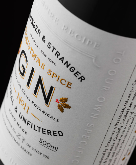
    Needs more typography.

    DRIFTMONKEY 0Permalink
    UpvoteDownvote
    Flag
    • WOW @ Printing...ideaist
    • whoaaa shieeetbigtrickagain
    • blooody beautiful but looks like wine though!jxh112
    • sexy!OSFA
    Show [[ numHiddenNotes ]] more notesAdd Note
    SaveCancel

View thread

PrevNext
PrevNext
© 1999-2026 QBN LLC.
  • Log in
  • Register
  • Broadcast
  • Filter
  • Jingle
Made with ❤ by Krop Build a Portfolio Website