487K Montreal logo
- Started
- Last post
- 73 Responses
- MSTRPLN
This is probably timelined, but .....
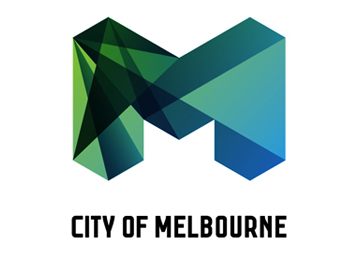
City rebranding for Montreal, cost 487K to develop this, and another 200K to implement it.
I think it's hot garbage .....
"Greater Montreal: Room to make it Real"
- trooperbill0
sigh - design by commitee
- ok_not_ok0
i like theo ld one

- look like 2 dicks...ArmandoEstrada
- never understood that logo
elb? expos league baseball? I don't see the M at all.fooler2 - Damn you Armando! I liked that logo. Why did you have to make me see this??Redmond
- what does ELB stand for?scarabin
- ********0
What exactly is this demonstrating?

- there are 5 circles in the logo and 0 golden spirals in the logo.
what a load of cockmunchery!jimzy - what a load of cockmunchery!jimzy
- the golden spiral is to show that the m fits in the golden proportions, do I have to explain everything?jimbojones
- yes jimbo, I'm afraid you do.
The golden spiral reference seems like a bit of an afterthought really to me.jimzy - the proportions of the logo seem like an afterthought? if anything, it's the other two...kingsteven
- jimzy, it's a bonus. clients love this shit, I don't blame the guys if they want to throw in some "science", it's not like pepsijimbojones
- it seems more mathemathical than creative..hektor911
- "clients love this shit" - jimbokingsteven
- Presenting stuff like that makes them accept semi-shitty solutions easier :)jagara
- Demonstrating that they fed them bullshitMimio
- this diagram reminds me of the pepsi redesign bullshitscarabin
- there are 5 circles in the logo and 0 golden spirals in the logo.
- jimbojones0
this is a really nice mark AND a really nice identity system, thought out and all. memorable, modern, plenty of room for develpoment. for a city, look how many cities have decent marks. but you probably think that one or two designers pocket 487K, so you probably won't understand.
- <********
- No design is worth half a mil.luckyorphan
- get out of this thread lucky!
If a good design helps generate additional revenue and enhances the repuation, why the hell not?Amicus
- <
- benfal990
timelined of 1 year or so. but it's ok, c'est pas bin grave ;)
- benfal990
its on since a year or so and i never saw it anywhere
- Gucci0
Must we shit on everything?
Sheesh.
In the original critique post for this logo, someone linked an image of rainbow toe socks to demonstrate their dislike of it. I apologize for not remembering who did it though. I thought it was funny.

- jimzy0

- nice methinks!jimzy
- weird 90s vibe?erikjonsson
- I like it too.Redmond
- +1Gucci
- ehdoesnotexist
- very early 90's..... I can hear certain music in the background, visualise the old macs.....vaxorcist
- benfal990
787,000$ for this, i would have done it for 2,500$ in a weekend.
;-)
- but you didn't, did you? loserjimbojones
- I HATE YOU!!!
WAAAH!! WAAH!! WAAHHH!benfal99 - 487 + 200 = 687luckyorphan
- taxiguerrilla0
Loosers
- ahahahahhahahahahaha
fuck yeah, they spend like a billion on itGeorgesII - I hope this has been drawn by Berlusconi's child-lover Noemi.taxiguerrilla
- this is the kind of logos my company likes us to design... sighdirtydesign
- damn.... looks client-ized, like it might have been okay before the clients ideas were used....vaxorcist
- ahahahahhahahahahaha
- jimbojones0
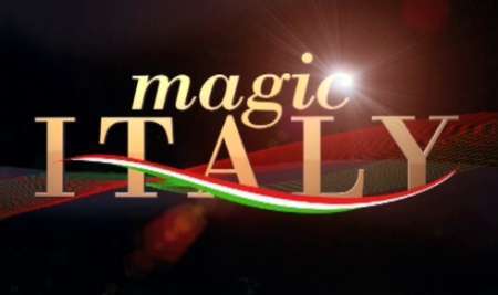
I thought that was Italy's mark?

- and landor ain't cheap eitherjimbojones
- thats another billion just there,
I'm not even jokingGeorgesII - i believe you. fuck they didn't even bother to tweak L and I for lowercase...jimbojones
- don't forget to visit our wonderful portal www.italia.it
cost €45 millionsGeorgesII - you mean 1,000,000$ ?!benfal99
- 1,000,000,000$ ?!benfal99
- bwahahaha I threw up a little...jimbojones
- No I mean 66,729,023.78 USD
ffuuuuuuuuuuuuuuuuuu...GeorgesII - 1.000.000 benfaljimbojones
- Sold!GeorgesII
- GeorgesII0
when you see the shit they trow around, that Montreal logo is fuckn awesome.
- kult0
I've only spent about 2 weeks in Montreal (loved it) so maybe my opinion is too foreign -- but I feel like this doesn't speak to anything that was great about the city.
- ********0
- I love this as welljimbojones
- waiting for the right client to rip it offjimbojones
- it looks like montreals step sister********
- its the same concept, wth?!benfal99
- this is pretty sweetSigDesign
- way better executeddeadfinch
- MTV did this years ago********
- here's the insipration
http://www-personal.…BannedKappa - dude that is badasswrong
- Douglas0
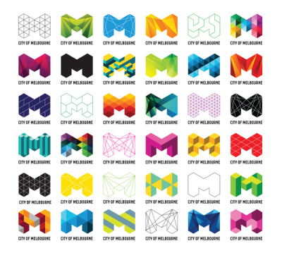
Every logo these days seems to be filled in with a bunch of different patterns.
- GeorgesII0
pattern is the new black
I'm enjoying this trend, remember when everyone had to use a coat of arm
- hektor9110
I'm currently working on one for a city in Texas. Wish me luck.
- I liked the logo by the way.hektor911
- make sure you use patterns and the first letter of the city********
- that's cool. well, hot as in texas. :-)akrokdesign
- luckyorphan0
No design is worth half a mil. I don't care who did it or how long it took.
Add to that the fact that a city has a budget, and every penny spent on design is taken away from other municipal duties. I can understand re-branding, especially in such a cosmopolitan city, but $687k is ridiculous.
That being said, as a design solution, it's decent.
- they could have bought 150 new CC TV camerasraskolnikov
- No football player is worth $100 bln. I don't care what he did it or how long it took.jimbojones
- < agreed.luckyorphan
- akrokdesign0
well, the old version didn't work at all so it's a great improvement.
