jack in the box redesign
- Started
- Last post
- 66 Responses
- robotron3k0
wait a minute, looks like they changed their name to:
"Jack Jack in the box" does that mean their are two jacks in the box... i'm confused...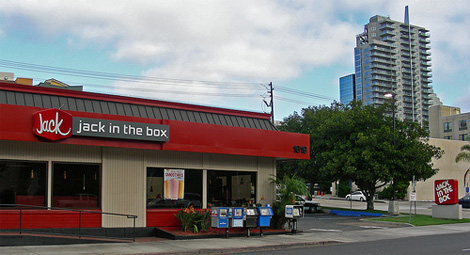
- which mean they need to take one jack off!??!robotron3k
- one two three four!monNom
- moldero0
jack in the box will kill you
- dbloc0

- the bevel blows though.akrokdesign
- and drop-shadow. aaaaaah.akrokdesign
- :-)akrokdesign
- boobs0
Their new shitty logo is better than their last shitty logo:

- fooler20
they should have rounded the corners on every corner of that box or non at all.
- PIITB0
Now that is a good re-design.
- monospaced0
The original logo has a funky feel to it that was in style decades ago, felt dated for a generation, and now has the potential to be updated today. Current trends toward "retro" type styles would have pushed me to update the existing mark instead of starting from scratch. I hate to say it, but when the signage is up on the storefront, it's now forgettable. The old mark had serious equity.
- sofakingbanned0
I like it. well played.
- uberdesigner0
nothing says salmonella like a rebrand
- Meeklo0
I like it too!
I love the Jack box, I'm not feeling the "in the box" on the side.
I would just leave it as "JACK" looks great, love the type.Anyone seen the mini burger commercials? they always make me laugh..
"herding cows the size of snauzers but they are cattle"
- fooler20
I guess this is for real, I saw the new logo on TV last night
- brains0
mixed messages. looks like "jack" is ON a box to me.
- morilla0
I dig it, but the "jack in the box" typography on it's own is bothering me.


