jack in the box redesign
- Started
- Last post
- 66 Responses
- fooler20
@Antonelli
I saw the Jack in the Box redesign here when whoever started this thread originally posted it but it was never confirmed. Looks like a student project to me.
Then today driving around I saw the new Baskin Robbins and it made me think of both of these.
I'm glad these company's are keeping us employed but wish people would stop redesign logos already.
- Antonelli0
it has it's faults. the "K" being all alone on one plane of the box, they could've put two letters on each plane. Plus the 1995 techno-looking "in the box" looks like shit. The "Jack" script alone, however, looks really sharp.
- uberdesigner0
hate to say it but the redesign looks really good
- Antonelli0
lol fooler. what is up with you? first the baskin robbins thing, now this? no shit it's for real. it's already up in restaurants everywhere :)
- brains0
mixed messages. looks like "jack" is ON a box to me.
- fooler20
I guess this is for real, I saw the new logo on TV last night
- utopian0
* improvement
- erikjonsson0
ive seen that exact stroke of the c somewhere else. its only a matter of time before someone posts that excact treatment here
- moldero0
I got fatter just reading this thread.
- toochie0
I just sent this post to my friend who works for jbx coporate marketing. Let's see what happens.
- .. they pull the campaign??lukusW
- bring it on! :-)akrokdesign
- uberdesigner0
nothing says salmonella like a rebrand
- sofakingbanned0
I like it. well played.
- fooler20
they should have rounded the corners on every corner of that box or non at all.
- dbloc0

- the bevel blows though.akrokdesign
- and drop-shadow. aaaaaah.akrokdesign
- :-)akrokdesign
- robotron3k0
wait a minute, looks like they changed their name to:
"Jack Jack in the box" does that mean their are two jacks in the box... i'm confused...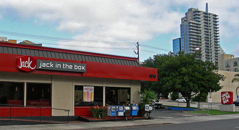
- which mean they need to take one jack off!??!robotron3k
- one two three four!monNom
- lukusW0
and

- lukusW0

- red + script font + a box .. ut ohlukusW
- noobmonospaced
- yes, i am fairly new around here - pleased to meet u!lukusW