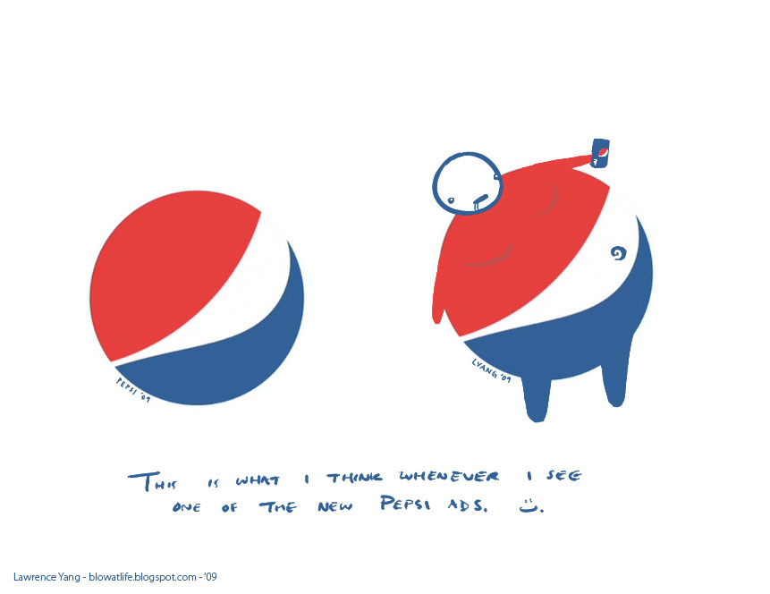
Pepsi Logo
- Started
- Last post
- 43 Responses
- Stylus0
Cuke > Popsi

- jellofunk0
pepseye

- utopian0
It just dawned on me that the new Pepsi identity reminded me of Dick Cheney's smirky smile:)


- fiesta0
Obamas logo is shit... but so is every presidential campaign logo.
- It worked.joeth
- How is it shit? Anything specific or are you the authoritative "Yay" or "Nay" when it comes to logos?adamrobertson
- jteore0
It looks like shit.
The identity has now placed itself into "everything else" overly corporate.Guess they are not concerned with standing out in the market place anymore.
More bells and whistles.
- 3030
I really don't care. The only reason that I buy Pepsi from time to time is that Pepsi is cheaper than Coca-Cola.
- Nathan_Adams0
And finally some sense...

- The Mountain Dew bottle looks like a green turd. I've never been a fan of the Mountain Dew brand.adamrobertson
- dbloc0

- they should go back to this logo. Timeless.dbloc
- Too Coke-like though. The two might as well merge.adamrobertson
- zaq0
- JSK0
They are all rips

- pepe0
it looks like an airline and it looks too different from their old logo. there is a 15 story billboard outside our office and if we hadnt pitched on a job for it there is no way to know its actually pepsi. it just says JOY. i think their strategies as much at fault as the logo design
- i like their giant billboards. just not the logo.skt
- I think their strategies are brilliant. Coke's pathetic strategies of soliciting Bob Dylan on the other hand...adamrobertson
- utopian0
Pepsi's new logo is almost as bad as the London 2012 logo!

- it only recently occured to me that the shapes were 2 0 1 2ninjasavant
- thizzbobby0
I personally like the Pepsi rebrand, if for one reason only...
While all of their competition's merchandise is plastered with "NEW FRESH TASTE" or blocks and paragraphs of type that explain to an idiot what a soft drink is, I quite like how the new Pepsi packaging is nice and clean. I just saw a stack of them this morning, and it really rang a different note with me for the first time yet, to see a major brand like this be bold enough to get rid of the frills, and stick to simple, un-plastered-with-value-added-me... packaging.
The Pepsi mark has never made sense, at least they TRIED to make something useful out of it. The packaging is what really does it for me. Also, the cans look quite nice with their matte finish, but the bottles are significantly less attractive, IMO.
IMO MAN, IMO.
- laurus0
http://adage.com/agencynews/arti…
look at the PDF.
This is one of the greatest examples of reverse engineering of a concept to create pseudo scientific rationalization for a design (most of the claims have no ground whatsoever – e.g. golden ratio is not proven to create more pleasing proportions. It is also almost certain that it is concept that only dates back to the renaissance). One can only admire the creativity that went into convincing the client that their half mill was well spent on the design.
- sorry, more than a milllaurus
- This was a hoax. Google it.adamrobertson
- joeth0
Ok, I totally saw the rip in the campaign. But didn't realize just how similar the logos are until now. Turn the Pepsi upside-down and you pretty much have a dumber version of the Obama.

- Stylus0
I prefer Cuke

