Brochure Cover Crit
- Started
- Last post
- 30 Responses
- evanburke
Target: 16-22 year olds.
I've used the "highlighter" theme pretty extensively throughout.
Which cover do you like best?

or

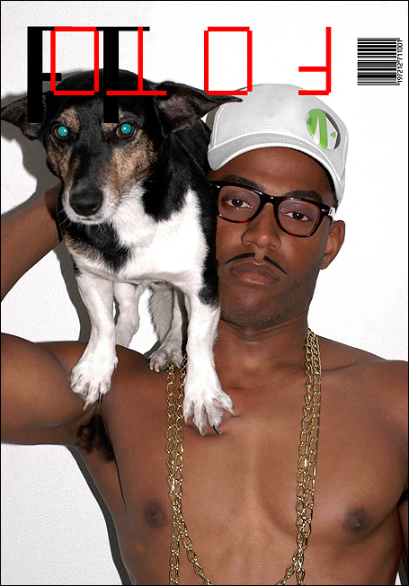
- Florida0
Vier5
- evanburke0
I don't know what that means. :(
- NotByHand0
I'm 23 years old... so I obviously have no idea what you're trying to communicate here.
- evanburke0
You're too old!
- jaylarson0
Get rid of the highlighter, center the logotype under the seal. done.
- evanburke0
Nah, the highlighter is staying.
- Point50
yeah, I must be way over that demo because the images posted at the top of this thread only look like someone dropped their marketing homework on the ground in the cafeteria. It doesn't really say brochure of any sort
- Jaline0
You are saying, "LOOK HERE. LOOK AT THIS SEAL AND COME HERE".
- ukit0
There is a right way and wrong way to do something like this. Unfortunately it looks like a mistake rather than clever.
I would try a different approach.
- Florida0
- and this means?Amicus
- nothing?Florida
- parisian gay stuffFlorida
- It means Gwen Stephani has gone downhill.bulletfactory
- SHAMAN0
i like where you are going with it... i do agree though too much highlighter be very selective with what you highlight... i like the second one - is this a front and back cover?
- Akiraprise0
looks like it's been highlighted in blood more than anything...