Poster Crit.
- Started
- Last post
- 36 Responses
- neue75_bold0
is it supposed to be ironic? Like saying something is new, but making it look like it was made 10+ years ago? You might want to harken back to an era a bit more bygone methinks...
- mistermik0
ahh every time i go to say something constructive it sounds terrible.
I'll move on.
- leewilson780
you need to read up on geometry and white space.
- rybo0
any more feedback?
- imnotadesigner0
kerning is horrible... looks like you tried to make it tight but its just not done properly
- fresnobob0
Smoke Weed
- gentleman0
designers republic back in 1999
also the leading is far too tight.
society 47 - is too prominent for something that has virtually no role
bit of a font orgy & as trendy as them lines are in the background. you havent made them work hard enough. they serve no purpose - they dont have anything to do with 'new' or even interact with text.
it looks like you panicked and used some 'filler' to add more cowbell to your poster.the text looks like its straight out of an 'engrish' dictionary and you could write it a bit better. + who the fuck doesnt know what NEW means..
if you want to 'own' that word - you need to give it a meaning that relates to you. - not just.. 'oh.. well it comes later - cause we do too'
ie. new = something you have not seen before. new = outward looking. etcit basically feels like you are taking a shit loada references from a shit loada places in a complete vacuum. totally devoid of context.
try to figure out why each of these elements belongs on your page and make them deserve a place there.
otherwise you might as well put a dick on the bottom right corner
- Llyod0
it looks like something I would've made 5 years ago. Do over
- 3point141590
way to many fonts, other than that interesting...
- tank020
These book are manuals i still check when i'm designing.
These kind of rules work in combination with your own creativity.
- typist0

- My E is better lolrybo
- you wishtypist
- OUCHdoesnotexist
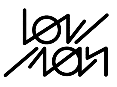
- I've always hated this logo, despite the ambigram styleAmicus
- moamoa0
yeah rybo, listen to tank... very good book.
if you go shopping you should also grab this pieces.
use them as your bible.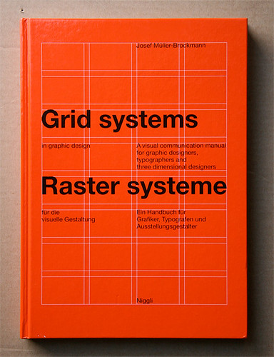


- tank020
You should read that book that i suggested.
you got al the right elements and this book will learn a bit how you have to organize them...
- monospaced0
What did you learn from this?
- rybo0
Cheers guys this is the response i expect, listen im young just need a bit of direction from time to time. all taken in thank you
- monospaced0
You need to get rid of the second "New" in the definition.
Decide whether you're going to use punctuation (periods) or not; There's a period after "New" but not after the definition.
Left-align the text better and make it much smaller.
I see a hairline gap between an ascender and descender. Fix it.I also agree that this poster is more about looking cool than actually promoting your work.
- doesnotexist0
where's the concept?
- dyspl0
to answer your question, about the text, I'd say that you could play more with the definition and the word "new"
Regarding to your definition, I would play with repetition : a font made from dot as you did. the same word again and again, but slightly changing along the differents words and so the last would finally be "NEW".
this is just an idea and there are many others.The general feeling I have is that you first focus on a meaningfull and strong message (as tDR used to do, and I know you like their work ), and then you try to make the whole thing looking nice, and that's where you seem to loose the path.
for me everything should follow the message, that's the aim of this kind of work, and that waht makes it "nice".just my 2cent.