Logo of the Day
- Started
- Last post
- 934 Responses
- _niko0
lol looks like they flip-flopped and capitulated to...I don't know who exactly.

- the new one is superior in every way design wise. How do you embroider the original? and what's that weird kidney-bean shape supposed to be?_niko
- The shadows on that man creep me out. The two-toed leg, Michael Myers and his body parts barrel. And that chair made of bones and hair.bezoar
- The website is down! :))********
- Error 403 Forbidden
Forbidden
Guru Meditation:
XID: 23999941******** - No it’s notmonospaced
- Yes it is
https://i.imgur.com/…******** - Yeah, so no, it isn’t. Maybe where you live.monospaced
- That’s right. You’re many thousands of miles away in a foreign country that basically doesn’t exist to anyone over here. You input is less than meaningless.monospaced
- ********-6

- Stripe using the dot as a new symbol...********
- I don't know what sucks more_niko
- New!bainbridge
- I approvecapn_ron
- Stripe using the dot as a new symbol...
- ********2
- amazing that with the tools we have we became so lazy. He nailed that b curve with a pencil and a fucking French curve ruler and his eyeballs_niko
- The one on the website is still messed up now. It's as if they live traced it.bainbridge
- ********-8

- Gabriel8

- cool but nobody gives a fuckmonospaced
- Like it! So much so, I gave a whole fuck.ShaneHolley
- I like it too! It’s really nice. But where do you see the logo?monospaced
- On Crocs not yet bought?
It's a really nice revision.Nairn - But their website needs more pop-up windows to make their rebrand complete.utopian
- Well done, sirs.wagshaft
- GREAT!AQUTE
- This was not an official redesign. But was done a few years back by Stephen Kelleher who is a fantastic designer.Centigrade
- Love it, but I'm still not buying Crocs. No way.Krassy
- They've made Crocs look cool, as a brand, but they still look fucking wank and I'll never wear themIanbolton
- never had a pair and never will.renderedred
- fantastic new logo. Obviously, a shit product.CyBrainX
- renderedred3
- Here is the post you have to fight your way through an article of guff to get to... https://shorturl.at/…webazoot
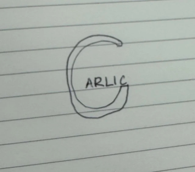
- Arselicdbloc
- I can taste it.utopian
- Thanks @zoot!renderedred
- Shit logos or whatever that qbner was doing?hans_glib
- Car likChimp
- ********-8

- https://upload.wikim…
https://commons.wiki…
etchans_glib - It's from the Colgate product:
https://logos-world.…******** - < but I guess in this case it actually works.
Amazon arrow is not a smile, it's "from a to z"******** - Amazon is also a smile.monospaced
- a little forced and unbalanced. It doesn't look great on dark here https://www.colgatep… looks like an ass_niko
- @monospcaced you mean a grin but okay********
- what a little bitchmonospaced
- amazon-edAQUTE
- I don't recognized C and P in the version on the right.CyBrainX
- https://upload.wikim…
- _niko2
though this was pretty well done for these anniversary type logos
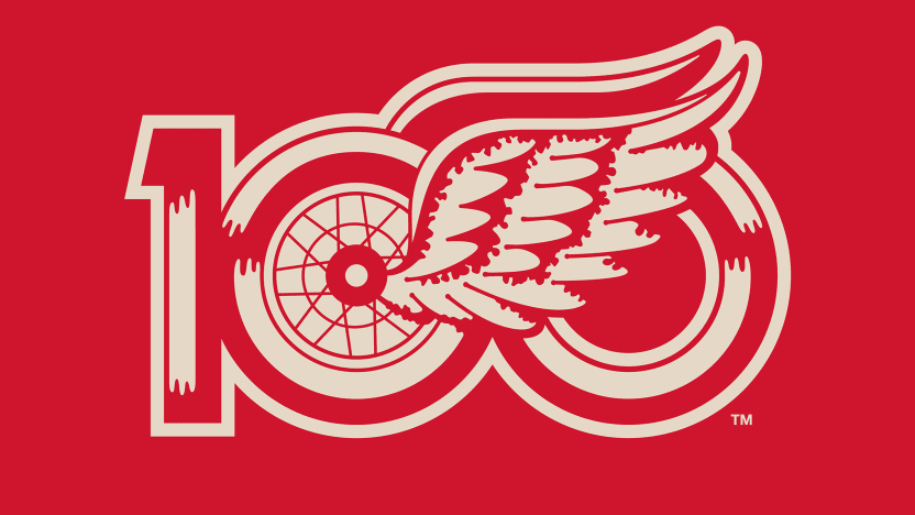
- actually, here's the centennial jersey to go with it, great attention to detail_niko
- https://www.nhl.com/…_niko
- ^ Lovely!ideaist
- https://www.tshirtso…uan
- Just a tee would be cool nuffcanoe
- https://shophockeyto…canoe
- utopian3


The new team logo -- the head of a mammoth with a curved tusk -- features several Easter eggs for fans.
The snow-capped Wasatch Mountain Range makes up the top of the mammoth's head. The silhouette of Utah and a negative space "M" are hidden on the left side of the logo. The curved tusk is meant to evoke the letter "U" for Utah. "Tusks Up" is the team-endorsed rallying cry for Mammoth fans.
- ********-6

- i mean for an anus logo they are quite consistent.milfhunter
- Did they copy QBN?PhanLo
- wtf is that redcanoe
- Shows they’re all using the same shapemonospaced
- OpenAI using the same grid/shape for all their logos, oh my you don't say********
- canoe0
https://www.ncaa.com/news/basket…
NCAA Final Four logos since '85
- dbloc8
"The unique characters of Utah 2034 are embodied in it with shapes and angles reminiscent of the landforms of the American West, as well as those of athletes in action."

- I want to both like and hate this logo,
all at the same time.utopian - I thought the same. The more I stare at it though, the more interesting it gets.dbloc
- Olympex Twinmonospaced
- It’s definitely has visual interest. And it’s surprisingly legible. Not a shit show like the old London one.monospaced
- London 2012 was a shitshow? Huh.
I like <this, although more for a retro 70s sci fi application.Nairn - *likesPonyBoy
- #lookslikeadickfooler
- I can see that fooler
https://snipboard.io…dbloc - I wasn’t a fan of the London one no. Unpopular opinion? I thought it was a mess personally but I’m not the final word :)monospaced
- Isn't that just a font?PhanLo
- Dude, it's in 2024; LITERALLY the future. I think it's great AND Utah is great. Went to Moab to run an ultra marathon a few years back...ideaist
- ...AND maybe the futuristic vibe will defer folks from thinking about the mormon "unpleasantness" that this state gets guff for.ideaist
- Mormons are future space gods. So...monospaced
- I don’t mind it but that rationale is absolute bollocksMrT
- @monospaced, sounds cool, eh?
: )ideaist - looks indigenous... is that what they meant by "west" lolcanoe
- The more i look at it,
the more I want this as a font.
Shit would laser-cut SO nice.Nairn - I see dongs.BK
- You need therapy for that. Not all ink blots look like dicks.canoe
- more Wolf Olins garbage?cannonball1978
- landforms? What did you drink?milfhunter
- I like this, but I still love the hate the London 2012 branding received. It was a great brand and it still looks relevant (and a mess) todayIanbolton
- Reminds me of 90s/early 2000s techno fonts like this https://typedifferen…yuekit
- @yuekit:
https://burodestruct…
#Classicideaist - Sweet! This is amazing
https://burodestruct…yuekit - @yuekit, reminds me of PS1 Wipeout packaging; changed my brain!
https://i.ebayimg.co…ideaist - In the not too distant future, wars will no longer exist. But there will be Rollerball.monNom
- Like how each character has equal parts white and black space.stoplying
- https://images.axios…dbloc
- ^ Heck! I like that. The
UT
34
version's real neat.Nairn - that style is used a lot by young designers around here...for some years now
https://i.haasie.com…
I like it.uan
- I want to both like and hate this logo,
- ********-4
^
refs

- Also Armin Hofmann ref
https://i.pinimg.com…******** - Waiting to see the sports icons set********
- They pulled of something extremely difficult. Unique, fresh and topical._niko
- fuck yo ratiosAQUTE
- Also Armin Hofmann ref
- Nairn2
For a company that does herbs and spices. Obviously.