Logo Critique if you please...
Logo Critique if you please...
- Started
- Last post
- 49 Responses
- CincodeMayo0
This thread is brought to you by the letters E, D, and B and the number 8.

- ********0
aliging the counter of the 'e' to the b is bound to make an 8...
all it says is 8 to me.
- But to be honest... does it matter... its just a marque********
- But to be honest... does it matter... its just a marque
- ian0
Ta for the nice words concrete. Hope I helped some. If your working on it today, hit us up with a revised version later on.
Oh and if nobody else has said, maybe needs a little more cowbell...
- neverblink0
was fooling around with this..
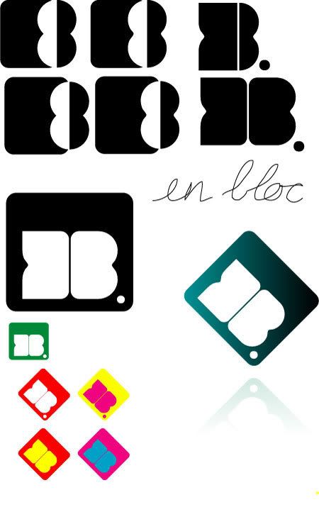
- the one in the black square is a whole lot better than what i have seen before..********
- Thanks, nverblink. I do appreciate people's opinions but I don't want my identity designed for me. :)Concrete
- And you should.. I just had some ideas that needed to come out ;)neverblink
- hehe, still better though! :P********
- Good to see your constructive side come to the fore in this thread, Janne.detritus
- good one!pascii
- the one in the black square is a whole lot better than what i have seen before..
- Concrete0
Thanks everyone for your ideas and help.
Sorry to be annoying, but I have since produced something very different, which I like better. I'll post it up later...
- Dancer0
* taps foot waiting for website
:P
- i_monk0
Show it, you bum.
- Reeno0
Really caught my eye... I like it! keep the dot at the end.... nice touch.