Logo Critique if you please...
Logo Critique if you please...
Out of context: Reply #44
- Started
- Last post
- 49 Responses
- neverblink0
was fooling around with this..
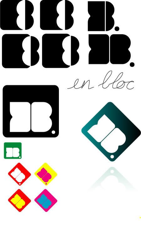
- the one in the black square is a whole lot better than what i have seen before..********
- Thanks, nverblink. I do appreciate people's opinions but I don't want my identity designed for me. :)Concrete
- And you should.. I just had some ideas that needed to come out ;)neverblink
- hehe, still better though! :P********
- Good to see your constructive side come to the fore in this thread, Janne.detritus
- good one!pascii
- the one in the black square is a whole lot better than what i have seen before..