Show some recent work
- Started
- Last post
- 8,596 Responses
- dibec0
Been working on a little exhibition 720 HD video. Here are some samples ...
Here is the direct launch if you are interested in some more info: http://www.dibec.com/12AM/12AM.h…


Almost done with post production
- MSTRPLN0
.... and another

- MSTRPLN0
Sneaker thing I threw together with the Shamuflage pattern.

- designerror0
Logo for restaurant

- how do you pronounce that.
the type and mark are nice;digdre - any link to the Ж ?neverblink
- the Ж is pronounced as 'Che'neverblink
- is it down?bulletfactory
- how do you pronounce that.
- drgss0
90% of people posting their work in this thread are lurkers
regulars dont have any- I'd say 99% of posters aren't really allowed to post up agency work in a public forum. how many of these are WIP? I'd get crucified if I did thatkelpie
- ...crucified if I did thatkelpie
- Where's your post? And don't bloody chat away in here - it's the one relatively unsullied thread we've got!Nairn
- ok, i shut my mouth - you did post a couple a way back - though they're not viewable any more - Get 'em back on!Nairn
- It is true, I can't post work agency work...OSFA
- I thought you were doing your own thing these days, OSFA?Nairn
- luo0
a bit random -- but here goes, customised my small dustbin!

- qbnternet0
@moamoa
once i have some i'll post it
- qbnternet0
some really nice work in here
- ls3designs0
Comps for site redesign for Cetaphil Cosmetics:


- JerseyRaindog0
A small personal project - a set of badges.
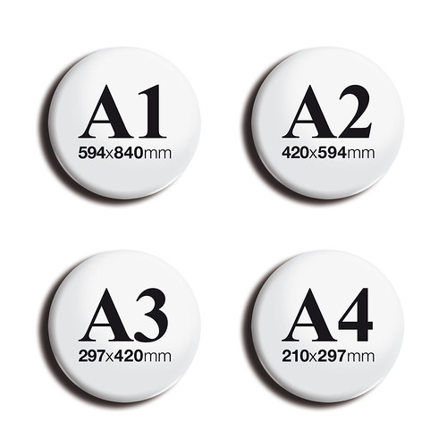
- nice :) I know you want to have a bloc, but the A4 kerning is to wide, maybe you could modify the 4 to keep your blocmoamoa
- Dammit moamoa - why must you always be right!? ;)JerseyRaindog
- ice.digdre
- :) sometimes just sometimes I am right :)moamoa
- ..except in your spelling of course: it's TOO ide, not TO wide, unless you were refering to a verb.Sandder
- how would the ladies respond if i would wear one of these?janne76
- I think you would have to wear some clothes too Janne?JerseyRaindog
- matteopaints0

Victorian Greenhouse (Tepidarium di Rooster)
Oil on Canvas, 90cm x 90cm
©2008, Matthew Bates, Firenze, Italia- Wait. it's a painting? I thought it was a photograph.digdre
- Believe me it is a painting, it took me almost a year to finish
matteopaints - nice!Copey
- Beautiful work matteoJerseyRaindog
- Thanks!matteopaints
- beautifulqbnternet
- very good!janne76
- JerseyRaindog0
Revised those Less magazine spreads slightly and some other finished spreads.

- In my opinion, the pagination is little to bgig comared to the content text, otherwise, nice. I like the rest, looks class, and 'rustgevend'digdre
- Fair comment digdre. It's a personal taste thing. The actual page size is closer to A3 so everything is deliberately big.JerseyRaindog
- cls0
Working on some sort of smoked out alphabet.

- cool, burn oneJG_LB
- Even if I'm smoked out I can't be scoped out
I'm too ill, I represent Park Hill
See my face on the twenty dollar bill
Cash it in, and get ten dollars back
The fat LP with Cappachino on the wax
Pass it in your think, put valve up to twelve
Put all the other LP's back on the shelf
And smoke a blunt, and dial 9-1-7
1-6-0-4-9-3-11
And you could get long dick hip-hop affection
Allways have to think about the cappadonna bit from Winte Warz, one of my all time favouritescls - to much text for this piece of sitecls
- My friend Jakob has done something similar http://www.formconsp…Leigh
- Click 'Formconspiracy Illustration'Leigh
- nice work from your friendcls
- I like that clsuncle_helv
- if you like playing with 3d, fumeFX makes nice smoke effects.
dyspl - Thanks uncle_helv, and displ will have a look at fumeFX but this one is all photoshop no 3d involved.cls
- niceskser
- Really cool. Or hot. You decide.5timuli
- JazX0
OK the real reason I came back here: http://www.loopkit.com/registrat…
Verbiage and layout still need some work, but the overall shape is there. It's an e-commerce CMS that will enable us to upload original sound files and enable users to share them, etc. Hopefully, we will allow users to embed audio objects into other sites much the same as what YouTube! does. As well as support iPhone, Android and facebook. Worth a shot.
- Alignment's a little severe?Nairn
- Also, your front page as-is assumes that I know what Loopkit is. I don't.Nairn
- Nairn, it's all screwed up. The CMS isn't allowing us to align things properly. Needs a ton of work.JazX
- Exactly, the front page needs some Web 2.0 verbiage. "We do loops" or something simple. Agreed.JazX
- Does this work for your browser? http://www.loopkit.c… does it slide?JazX
- F*ck, you have to click on it from the site itself. Oi!JazX
- kelpie0
have had to sneak this out furtively in work in the last hour for my friends gig he's putting on (on my birthday! yayay!), as I am without home computer these days :( Go on, rip my type to bits you bastards ;D

- i quite like it, bar the obviously lazy throwing in of ornaments into the corner.skt
- Would be better witha full ornate border no?skt
- probably aye, I would have given it a bit more thought without our new studio manager trying to catch me out the whole time ;)kelpie
- no color? your cheap bastard! lol.akrokdesign
- No bad for a quickie kelpie.JerseyRaindog
- That's what all his women say...
*bum-tschinng!*Nairn