Serif Fontundrum
- Started
- Last post
- 11 Responses
- canoe
There doesn't seem to be an attribute handy to describe the characteristics of serifs needed to make this logo a
you-make-me-complete
type of feeling.
- canoe0
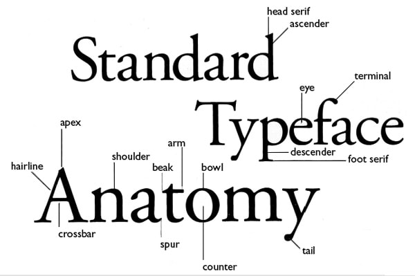
What is the name of this part of the anatomy?

- canoe0
I'm looking for a flat-footed serif, but it has to be short in height, and not stouty, more thin, thinner than regular.
These are not exactly the types of search terms font collections are used to.
- bulletfactory0
Interesting, never thought about that I guess.
I've heard the term "foot serif" which might suffice, or you could really lean into that and call it the "arch" of the foot serif.
Maybe?
- canoe0
Filosophia is nice but it's too compressed. Didot is nice but it's Didot, too ubiquitous.
- MrT0
I'm no expert but isn't this the Didone style that you're after? (aka Modern or Neoclassical, I believe). The flat foot is part of the broader style; higher contrast, less calligraphic, etc.
- imbecile0
In the context of a letter like 'k' where the serif protrudes past the baseline, and there's a space inside the serif above the baseline, that space doesn't have a specific, universally-recognized name that's distinct from other parts of the type.
However, in terms of describing it, you could refer to it as the "interior space" or "negative space" within the serif. It's the void or counter, but not in the typical sense of a counter which usually refers to the enclosed space in letters like 'o' or 'p'. If you're discussing this in a typography context with someone else, you might need to describe it in detail or visually show it to ensure clarity, as it's a nuanced detail.
- canoe0
After looking at the logo, I think I'm looking for a more consistent typeface, not so many drastic changes in hairline and ascenders.
Still looking at - Bely, but it's not absolutely perfect. Might have to edit it.
- canoe1
Adobe Jensen Pro LOL for the winner.
- monNom1
Be believe that is ‘trapping’, an ‘ink trap’ or a ‘well’. It’s typical of text faces designed to print at smaller sizes. The larger volume of ink at the wide base of the letter tends to diffuse into the paper. The indentation counteracts the spread of the ink, resulting in a straight line when printed on newsprint or other poor quality stock. Titling faces might have less of this because they are made for larger print size.
At some point this became a stylistic choice, rather than a technical feature. If you want to see a lot of trapping, look at bell gothic, a typeface made for printing very small on very poor quality paper (phone books).
- Bell Centennial was the one I was think of with the heavy trapping. https://en.m.wikiped…monNom