Logo Feedback
- Started
- Last post
- 21 Responses
- CincodeMayo
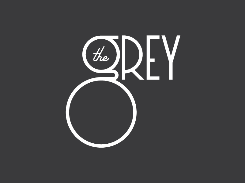
Working on some custom type for a client. Does this read as a "g"? Does it read as anything else? Is it obviously a g or could it be confused?
- uan0
yes.
8.
no.theGrey
- It is based off an 8 and doesn't hurt if that's read as well. But definitely want the g to be seen first and obviously enough.CincodeMayo
- capn_ron0
I read a "g" right away. ask a few older people, 50+ that are not in the design field. I've found that helps me sometimes.
- Working that angle too. Testing this sucker to make sure it reads as The Grey to designers and non-designers alike.CincodeMayo
- by the way, it is really nice. elegant. good work.capn_ron
- Thanks capn!CincodeMayo
- yupmoldero
- imbecile0
osprey
- detritus0
Reads as a G, yes - I trust you've tried it in whatever context it's going, so it's definitely not too big?
Also, personally, I'd nudge 'the' up a bit and see what that looks like. I'd also play with the arms on the E, extending them to play with the space to its right, filling between the form of the R and the Y. It'll probably look terrible, but I'd have a play anyway.
I'd love to know what this is for!
- Good tips. I'll give those a try and see how it looks. Can't say what this is for just yet, but client was OK sharing it for feedback. Thanks!CincodeMayo
- The 'the' is perfect example of perfect centre vs what looks right. Definitely needs to go up a bit.********
- lvl_130
Corey O is what I saw after I initially saw it as the grey. cannot be unseen.
looks nice though.
- Glad you read The Grey first. Corey O would be a great name for a tasty chocolate sandwich cookie.CincodeMayo
- mg330
Not gonna lie, the big O and letters made me think of this immediately:

- aha, a classic case of...
*puffs pipes, strokes chin*
...too much internet.hans_glib - O RLY?CincodeMayo
- aha, a classic case of...
- dbloc0
reads a a g to me. what kind of company is it?
- Not at liberty to say just yet but I'll keep you posted once I can.CincodeMayo
- hans_glib0
reads fine to me
i REALLY want to switch the curl between the two circles the other way around tho.
- I had it the opposite way originally and it looked more like a lowercase q. Not sure why but this direction seemed more like a lowercase g to me.CincodeMayo
- But worth exploring again.CincodeMayo
- horton0
Reads as fine Grey but I also see a monocle or spectacles.
Whats the business?
Win if its for a hipster eyewear boutique, or a college professor.
- *fine ashorton
- Definitely not for a monocle/spectacle place but now I totally see that! Can't say what it's for yet but glad you read it as Grey. Thanks!CincodeMayo
- umbee540
extend the "E" lowest stem to be closer to the "Y"
- I like that idea. I'll give it a shot. Thanks!CincodeMayo
- stoplying0
It looks really greyt.
- renderedred1
it reads ok, but i have a problem with lower/upper case inconsistency.
- Yeah, I wasn't sure about it either but it grew on me and the client wants the G to stand out. He's considering other versions with a capital G too.CincodeMayo
- desmo1
The 'g' looks fine, but id personally take 'the' out and find a new placement for it. It makes the logo busy having 'the' within the bowl. Maybe top align in the left corner?
- < yeshorton
- I hear ya. Presenting it with the "the" inside and outside. Works both ways in my opinion but definitely is busier when inside the g.CincodeMayo
- ********0
oreos?
- the outside. the rest is fine. the grey is what i read. redesign the R maybe to align with the middle of the E and the Y?********
- I mean the "the" outside the "g"********
- the outside. the rest is fine. the grey is what i read. redesign the R maybe to align with the middle of the E and the Y?
- BabySnakes0
My eye is so focused on the O of the g, at first glance i read it in my head as The Ogrey, but it could be my mild dyslexia.
- chukkaphob1
orey O
- ********-4
the orey O new fragrance
- ********-4

- SoulFly1
cincodemayo can we see how the custom type is looking now?