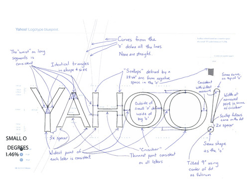
New Yahoo! logo
- Started
- Last post
- 136 Responses
- animatedgif0
PRAY 4 YAHOO DESIGN TEAM
Also found the Dribbble "grid" BS on the intro video hilarious
- ********0
My god this really is tragic. The whole thing. Just tragic.
- SlashPeckham0
Is this some kind fucking of joke! This somehow reminds of one of those shitty Batman movies from the 90s. Aol won awards when they rebranded a couple of years ago:
- From '90s Batman to Aol. What are you saying?monospaced
- its possible to refresh a brand to make it feel relevant and fresh - look at the vimeo linkSlashPeckham
- ah, I seemonospaced
- SlashPeckham0
they may as well have just done this:

- doesnotexist0
omg she got into those trenches hard
- inteliboy0
I don't mind it. Pretty good for Yahoo actually...
- Christian0
it's ok
- doesnotexist0
it's got those google vibes
- google 2007 maybeanimatedgif
- it's a beveled typeface it's still the same as the current onedoesnotexist
- desmo0
The fact that Yahoo showed me 29 shit logos first, makes me like this final reveal. Great strategy, Yahoo!
- I like a bunch of them more than this garbage.CygnusZero4
- doesnotexist0
brainwashed by flat then astonished by something 3D looking
- kona0
This is why it is so difficult to do what we do. We have to deal with shit like this, done by people like this on a daily basis. It's 9:52am and I want to call it a day. lol
- utopian0
- Its so bad. Its hard to believe they went with a generic type layout and a fucking bevel lmao.CygnusZero4
- I actually liked some of the other flat options. They looked more distinctive to me.CygnusZero4
- kingsteven0
after 29 flat logos in violet, they go for one in navy with a bevel?
yup
- ********0

- calculator0
Can you imagine her guffawing away whilst prodding keys and tweaking bezier curves.
Imagine the hate-filled bile rising in the bellies of the design team.
- dbloc0
the slow death of Yahoo!
- doesnotexist0
just look at this bullshit
- dbloc0
should have just stuck with this.