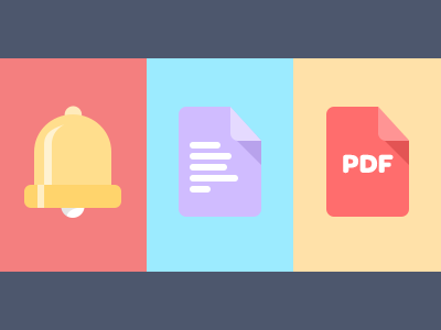
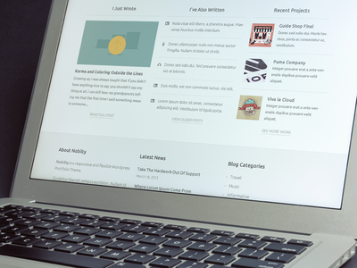
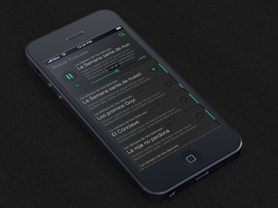
Flat Design
- Started
- Last post
- 180 Responses
- benfal990
- slickutopian
- I like this, what is it?ukit2
- radio vaticanshaft
- holly nice!uan
- Cleans.instrmntl
- wtf man. its dark grey panels with green highlights. since when is this new??????CygnusZero4
- one of those ancient design portal sites looked exactly like this in 2001. cant remember the name offhand.CygnusZero4
- mikotondria30
Can't wait til shit's bold again. A lot of this flat stuff is deliberately twee and appealing to 12 year olds.
Let's see what happens when monitors can display Genuinely Fluorescent™ colors or something.
I dunno, it just doesn't communicate 'Balls!', which always means the 'Balls!' shaped gap in the market will soon be filled and clamoring again.
With 'Balls!'.- Heh all of the engineers I work with LOVE 'Balls!' Everything I do for them is dramatic and over-the-top.d_rek
- haha, it takes all sorts, it's a totally cyclical thing, too. Ballsy metal and chunky / soft and delicate and light. Repeat.mikotondria3
- lol @ Genuinely Fluorescent. I'm trademarking that.ukit2
- Miguex0
^

- lessfloor0
Flat is Fat
- Continuity0
So, I guess the 'new' trend for 2014 will be 6pt aliased pixels fonts and glowing grid lines in backgrounds, yes?
- sine0
is Windows 8's interface pushing this trend in app design?

- to me it seems like an easy way to have your apps look current and fit in with new os looks. not just microsoft. android has a similar look.sine
- similar look.sine
- simplify, roll out quickly across multiple platforms (?). more a functional trend than an aesthetic one (?).sine
- and possibly also influenced by touch-screen functionality and "baseline" interactive requirements...sine
- on multiple devices and interfaces.sine
- lessfloor0
Phat, also works better responsively so long as it's all vector
- fadein110
Well its nice that some of the other big players are driving the current design trends rather than Apple... look how quickly their big trend looked naff. Clean and minimal doesn't date as quickly as glassy buttons and leather backgrounds.
- Mountain Lion's Address Book, for example? *puke*Continuity
- Nathan_Adams0
The problem is though when this "flat" UI design get's taken too far, and you can no longer tell clearly what are UI elements and what is just content. Subtle cues go a long way.
- Continuity0
From a purely marketing design perspective, I love flat, always did.
Where it gets a bit complicated is in UI. As Nathan says, subtle cues do go a long way, and over the course of, say, the last 15 years, I think users have become so accustomed to different UI elements having certain design elements used (for example, buttons having a raised appearance) that it might cause a bit of confusion. Kind of in the same way that there are certain signage icons we're all used to seeing and understanding and, the moment it goes off-piste, we get confused.
- georgesIII0
I like flat design, an example: When I switch from Android to IOS, I feel like going from college to playschool,
having texture when done right is awesome, but when it's done ad cazzum, it looks like shit and IOS has just too much unnecessary junk
- Irafis0

- neatgeorgesIII
- These themes have been available via jailbreak for yearsshaft
- itsricky0
I hear what you're saying guys, but the point raised earlier about not beginning any design with pre-set ideas is important. That's not being a responsible designer.
I think the whole 'flat is black' thing is 'hot' and getting a lot of coverage at the moment becuase its dead easy to implement, its very easy to carry right through prototyping into finished design, and its very easy to support - fairly widespread browser support. The style lends well to Screen readers and the vision impared, and generally speaking, the user of the style takes any design down a 'less is more' path on the web, which is good.
I feel there are a few things happening at once in the industry though - one is that clients and agencies are waking up to the idea of multiple, simultaneous browsing experences on the same site, and that websites need to be a hell of a lot more flexible.
So I dont think Flat Design has just 'happened', a giant roadblock of usability and readability is being smashed down on the web, and flat design is just one of the tools we're using to break through.
Its an exciting time to be a designer!
- animatedgif0
Reading about this shit has given me so many laughs this year.
You can truly tell so many designers don't actually know anything about design and have just learned how to make some pretty buttons so this is somehow new and revolutionary to them. When really it's just life without layer styles
- Continuity0
@animatedgif
Too fucking right. For one thing, so-called flat design is by no means new in general ... anyone who's studied Swiss design will know this.
For another, in web design terms, even this isn't anything new. It was trendy for a while in the late 1990s, and again briefly in the early noughties.
Basically, from what I've observed over the years, there are three trends that cycle in web design:
1) Flat
2) Quasi sci-fi, 2advanced-stylee
3) Shiny Apple-stylee.My crack about 6pt aliased pixel fonts a few posts up actually wasn't that far off the mark, they've already seen their day twice. First time round about 2000 (in threeOh's heyday) and again when it was clear Flash was starting to die out. It wouldn't at all surprise me to see them come back in the next couple of years.
- Now I'm going to go make some chilli and lime chicken Ramen.Continuity
- toe_knee0
Why y'all mad? Its just the next generation discovering it