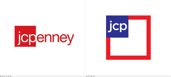
JC Penny Logo
- Started
- Last post
- 58 Responses
- dbloc
hmm. I don't know.
- FawnDog0
NO
- ukit20
America, fuck yeah?
- dbloc0
already up on the site.
http://www.jcpenney.com
- ukit20
"The new logo, I have to say, is damn impressive. It is amazingly simple, clear, and bold. It express the All-American feeling jcpenney is going for and it alludes to the American flag in a subtle and sophisticated way that makes every American Presidential candidate look like a doofus for not designing a logo like this before. This logo has the potential to transform the jcpenney brand from a mediocre mall brand into an American retail fashion icon like Tommy Hilfiger — perhaps not in quality but at least in appearance."
- what is so damn impressive about it? definitely not groundbreaking.dbloc
- waterhouse0
I think it will do.
- akrok0
it's better.
- monospaced0
no, it's not
- akrok0
yes, it is. you don't think it will save jpc from going under?
- scarabin0
yikes
- CanHasQBN0
Horrible. So cheap looking. It has zero lasting power. Why are these companies so obsessed with constantly messing with their logos? This is the shit they come up with?
If you're walking in the mall and see this signage from a distance, you won't be able to make out the "jcp" because it's so tiny. It does'nt reproduce well. Visibility SUCKS because the negative space of the square eats up all the real estate. The size of the "jcp" will always be dictated by how much space is available (on a wall) for the big square, and store signage space is mostly horizontal.

And jcp is the official name now? The acronym alone? They are prepared for people to know their brand as "JCP" now? Boring. With the previous logo, you could see the identity as JCPenney OR see it as JCP when it was used as a stand-alone icon. It was much more versatile.
The Helvetica typeface was classically theirs. Now they go with some trendy shit. And the way the jcp sits in the blue square is awkward. Not enough air on the left and right, and too much air at the top and bottom.
Lastly, "Americanizing" a brand cheapens it. For the most part, America is really tacky. Red-white-and blueing something just reminds people of trailer-trash rednecks.

- Your last paragraph is an uneducated atrocity.waterhouse
- I agree that Americanizing is cheap. It's a lowest common denominator move with primary color stagnation and cliches.CyBrainX
- I thought the original design was pretty shit to begin with.********
- bigbaby530
...and the New England Patriots...ugh.
- ********0
well, it seems better than before but...
...it was crap before and it's still crap.it's crap when you develop from crap to gap, I mean crap
- pango0
nop... doesn't really speak amerika.






- ********0

- ********0
looks like it families with these:

- you don't have drivers license?********
- huh?********
- dude. lay off the drugs.akrok
- you don't have drivers license?


