Credibility
- Started
- Last post
- 26 Responses
- _salisae_0
cheers for answering my deutsche question, Amicus! how are you? work going well?
- looking for freelance work to build my folio, and then I'm outta here.Amicus
- personally, I'm great.Amicus
- Oh yeah? Do you have a business plan? I've realized I pretty much have to work for myself and am developing a process for this._salisae_
- process for this. It does get a little one dimensional at times. I'd love to keep in touch – maybe we can cheer each other on._salisae_
- other on_salisae_
- gramme0
Symmetry helps.
- cannonball19780
Sounds like someone wants you to fast-forward the hard-won work that a credible logo does. Credible is in the eye of the beholder.
- Sep0

- Amicus0
Designed by Anton Stankowski
The logo supports the identity of Deutsche Bank – the “slash” stands for consistent growth and dynamic development– the square-shaped frame can be interpreted as a sign of security and a controlled environment. In summary, the logo square stands for consistent growth in a secured environment.
From here – http://www.db.com/en/media/Logo_…
- monospaced0
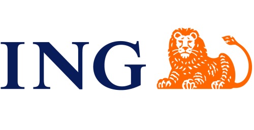
- that lion sure looks like it understands banking_salisae_
- really nice logo and brand overall._salisae_
- That lion would make any company seem credible if he were standing next to their name. Intimidating, actually.monospaced
- Serious cat is fucking seriousabettertomorrow
- exactly...put him next to the FOX wordmark and see what happensmonospaced
- oho. don't do that.akrok
- monospaced0
First things that come into my mind are animal logos, specifically Lions. Other than that, any company that grows to be respected is "branded" by that perception, and that brand will then be seen in the mark that represents it. Basically, it's not the logo by itself that defines credibility, it's credibility that does.
- exactly. i'm just going to have to explain this._salisae_
- abettertomorrow0
Perhaps a type only identity to get away from the usual iconography? I walked past a regional bank that just had their name set in a nice modern looking serif and it worked quite well.
- _salisae_0
It's my belief that if a co. has a well thought out brand design with good content (copy, photography, etc) then they come across as credible. A client I am working with wants to see credibility in the logo – I don't want to do this because I feel it stifles the brand.
"If you want to sell something to someone – don't tell them something. Instead, make them feel something."