Poster Crit
- Started
- Last post
- 78 Responses
- pango0
your photo is consider a high-speed photography that you find on flickr as well. just poor quality.
- eDissideNT0
cool)))
- eDissideNT0
cool)))
- pango0
let's compare what's out there with yours.


- zenmasterfoo0
i think what people are generally saying here is you can do better that this. If you're going for an art school project look, you've nailed it.
- pressplay0
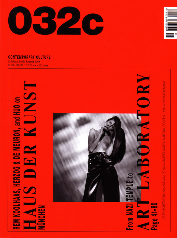
reminds me of this magazine
- skref0
Look, Sig has done the hard work for you, just print that out and get paid. Fucks sake.
- Jimbo820
Where can I get one?
- 4040

- flashbender0
needs more swiss design
or lolcats
- LOKi0
Not to be a dick, but now that I understand what you're trying to do, I wish you'd put some real thought into it. Being critical requires some ideas and not just a visual treatment, there's nothing in the poster really that communicates criticism, there's no message, just bad design.
Not to do too much shameless self-promotion (but why not, it's for a good cause), but if you're interested in creating critical imagery re: consumerism, download and have a look at this:
- 23kon0
"I wanted to juxtapose and challenge consumerism and create a negative Warhol, if you like. "
So, you're trying to do something clever but wanting the help of others on here of how to do so??!
OK, so even if you do some up with something clever/unique where would be the satisfaction of knowing that it isnt 100% your own idea?
Do your OWN thing dude!
Photo I took about 16 years ago!

- Interesting image, nice textures. What's the shadow though?PeterPancake
- it's a hand....Amicus
- PeterPancake0
Last bump ever.r...r, just to respond to the latest few comments and give them the respect they deserve:
Re creating a critical piece of art: I would love to create something clever and provocative, especially since the subject matter has so much to run with:
- Criticising consumerism
- The responsibilities of graphic artists in brand creation (as in what LOKi is introducing, and has written about in what looks like a very thorough and interesting thesis, which I will probably read)
- Challenging Warhol's positive portrait of mass production (the 'Coke is good' case)
- Alcoholism
- And perhaps more specifically the brand/authenticity war between Budweiser and the original Czech Budvar, from which the name is derived / stolen / consumerised / americanised...see http://en.wikipedia.org/wiki/Bud…
- Potential for interesting process, such as stencil or screen-print.
- ...etc...etc...Having said all that, my main and original goal was to create a poster for a friend to sell for not much more than the cost of its printing, giving him something he wanted, which I pitched to him at say, an ‘art school project’, or even a club flier, you get the idea. So, in conclusion, I will present him with these three options...
1. Minus the printed red, but framed in glass, with a narrow red frame.

2.

3. A recreation of Sig's version. Thank you, SigDesign.

I suppose the reason for all this back and forth is because of my conflict of interest in wanting to create a piece with significance vs. getting the job done with the least hassle (due to price point, my friend's expectations, etc). As well as that, it has been interesting and many useful ideas and links have come out of it, thank you.
AND YES OSFA, we got a fucking lol cube.
- sureshot0
hey here is where everyone is!
- duckofrubber0
What is the point of all this?
- dirtydesign0
that looks like a photo/poster from 1982.
start over.
