Poster Crit
- Started
- Last post
- 78 Responses
- spendogg0
the red frame must go
- cannonball19780
It needs MORE red. Oh wait, you can't make it more red. Because you Pushed it all the way to the extreme.
I noticed you didn't add any layer effects. You might want to pump all those up to 1000% too.
- Miesfan0
sorry you've arrive thirty or forty years later...
Learn, here a few:
http://es.wikipedia.org/wiki/Joh…

and btw, what is create a negative Warhol?- "negative Warhol" in the sense that he presented consumer products as a force for good, me the oppositePeterPancake
- hellojeehae0
i would keep it in one thread
- PeterPancake0
I think this thread has run its course, so here are a few closing words, highlighting some important points:
- @zenmasterfoo, I do believe I could do better, yes (and thanks), but of course that would involve more investment of my time and effort. As I said, this poster is a one off to be sold to a friend for little more than the printing cost and I think the level I'm pitching it at and even the level he’s expecting (or even wants) is what you've said I have achieved, that of an art school project.
-@23kon and JSK, I totally agree with your sentiment that I should be presenting art, with a confidence for art's sake, and for the crit->improve cycle, as is generally more associated with a design piece, (at least on forums like this,) like you said. BUT, I was interested to see what would happen, and to be honest, the art by committee that has resulted is if nothing, as far as I know, an original way to produce art. Granted, it could be more serious. Surely a social age needs socially created art??
Thanks. Any further comments are welcome, as always.
- OSFA0
OK, I see you have a 'purpose' for the red border. But you are asking us to crit your poster yet you choose to ignore the most basic comment and request 'ELIMINATE THE RED BORDER'.
If 90% of people are telling you it must go... maybe you should listen and consider it.
- Trust me, I'm not ignoring your criticisms. Anyway, this is WIP, so watch this space.PeterPancake
- identity0
the red frame stays - put futura black italics, tightly kerned over it - put it in museums
- Mr_Right0
Just try doing something that's visually interesting. Just make it kick-ass.
- Mr_Right0
Can someone tell me the way to post pictures. Cheers!
- identity0
I cant help thinking the person presenting this has EVERYTHING to do with this... I looked at it - and saw potentially some esoteric, high-brow dutch thing. If Karl Martens, Bruce Mau, Rick Valicenti did this - it would get published...
I personally think its pretty iconic
- OP310
what is the purpose for this poster? is it for your friends college dorm room wall?
- Lounge or home office. 'Purpose' explained here: http://www.qbn.com/t…PeterPancake
- ThePublics0
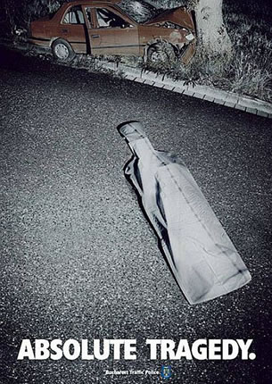
red frame is vastly annoying, otherwise, a broken beer bottle.
- chalk0
You guys are pretty retarded if you think this thread (or the previous one) is anything but obvious trolling.
Obvious troll is obvious.
- fresnobob0
take off the red border!!!!
Seriously... You don't need it. It overwhelms the image 1000 fold and makes it look like you are trying way too hard.
Also I'm thinking you could make the image more "edgy" with a more dynamic crop. Like, try having the bottle at a more extreme angle, maybe even running off the page. It looks too much like a portrait off a broken beer bottle now.
- duckseason0
Border hurts my eyes.
Other than the border, nothing really grabs my attention.
Looks like any other cheap, mass-printed poster that you'd find wheatpasted all around the LES.This looks more like an ad for Bud, not something that is "hurting a global brand."
- "this beer is so awesome it shatters the bottle!"pastpastdue