Poster Crit
- Started
- Last post
- 78 Responses
- cannonball19780
It needs MORE red. Oh wait, you can't make it more red. Because you Pushed it all the way to the extreme.
I noticed you didn't add any layer effects. You might want to pump all those up to 1000% too.
- OSFA0
Ate you kidding me?? I got an lol cube FFS!!!
- PeterPancake0
Props to everyone for their interest!
Here's a rough concept I've worked up from the livetrace made in Illustrator:

In trying and trying, it seems, at least to me, there is no comparisson between screenprints and a simulation of such in Illustrator. It's propbably my poor execution, but to anyone familar to Illustrator, a close look at the poster above and you pick out the tell tale sines of livetrace, and they're ugly.
Personally, I think SigDesign's treatment stands out above the rest:

- ..that'll be signs*PeterPancake
- i'm growing a tail.rodzilla
- sureshot0
hey here is where everyone is!
- pressplay0
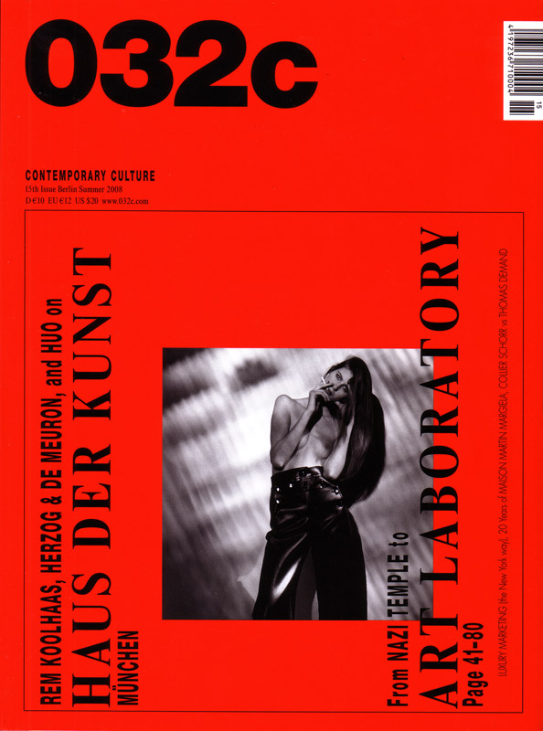
reminds me of this magazine
- SigDesign0
- I like that very much. A much more subtle use of the Bud red.PeterPancake
- PeterPancake0
Cleaning the image up in Illy at the mo, as per i_monk's suggestion. Certainly has more of a Warhol feel in vector. I'll respond to composition change suggestions once its clean, as I'll be able to experiment more given that its in vector format. Chuggin' somewhat on my 2GB RAM.
- chalk0
Roughly 1 minute.
- Douglas0
maybe this...

- <-----identity
- This is actually quite awesome.duckofrubber
- GRAFIK. Would work nicely with any information superimposed.PeterPancake
- it stays!!Douglas
- awesome lolset
- hahahapillhead
- identity0
Chalk
how much time have you spent on this thread?
- duckseason0
Border hurts my eyes.
Other than the border, nothing really grabs my attention.
Looks like any other cheap, mass-printed poster that you'd find wheatpasted all around the LES.This looks more like an ad for Bud, not something that is "hurting a global brand."
- "this beer is so awesome it shatters the bottle!"pastpastdue
- fresnobob0
take off the red border!!!!
Seriously... You don't need it. It overwhelms the image 1000 fold and makes it look like you are trying way too hard.
Also I'm thinking you could make the image more "edgy" with a more dynamic crop. Like, try having the bottle at a more extreme angle, maybe even running off the page. It looks too much like a portrait off a broken beer bottle now.
- chalk0
You guys are pretty retarded if you think this thread (or the previous one) is anything but obvious trolling.
Obvious troll is obvious.
- ThePublics0
red frame is vastly annoying, otherwise, a broken beer bottle.
- identity0
I cant help thinking the person presenting this has EVERYTHING to do with this... I looked at it - and saw potentially some esoteric, high-brow dutch thing. If Karl Martens, Bruce Mau, Rick Valicenti did this - it would get published...
I personally think its pretty iconic
- Mr_Right0
Can someone tell me the way to post pictures. Cheers!


