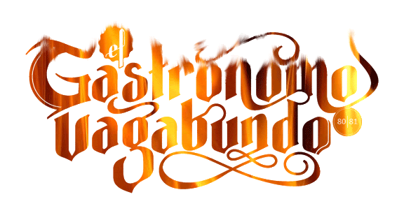
flame my logo
- Started
- Last post
- 22 Responses
- i_monk
The client loves it, but I'm sure the kerning is wack, and there's still a lot of little fiddly detailing to finalize.

- dbloc0
what is it?
- bigtrickagain0
it looks pretty damn good...
small points:
- the r in Gastronomo looks like it's floating in the middle of nowhere
- is vagabundo supposed to be uncapitalized? I'm not sure - the 'v' looks slightly bigtger than the other letters, yet it is too small to be uppercase
- the award-sticker black circle thing behind 'el' looks out of place with the rest of the design, but maybe it fits with the rest of their identity package
- the curve connecting the b and u in vagabundo - i don't like that awkward kink in itbut no, it's really nice (:
- CALLES0
i like
- bored2death0
I wasn't sure if it was "ef" or "el".
- ********0
I bloody love it. I don;t like the 'el' or the '80|81' bit though. 'el' is hard to make out and the '80|81' doesn't tie in well.
I'd maybe consider making the bottom of the glyphs fit the curves under the n tighter, especially with the gAb and the DO.
Looks really nice though! Me likey!
- bored2death0
I like the way the line creates dimension on the last "o". I don't think it works as well on the capital "G".
- tasty0
is this for tampons?
- grymes0
Just to say it. I dont think the depth thing you have going on the 'G' and final 'o' are working nor necessary.
- SteveJobs0
The Vagabond Gastroenterologist
i like it
- ********0
I'm surprised with the ability to create a logo that sexy you need us to flame it for you...
Well, I flamed it up for you anyway so here you go.
I want 20% though.
- bored2death0
The connecting swoosh on the "b" and the "u" is just awkward to me.
- i_monk0
bigtrickagain: R & BU - agreed; V is an issue, I don't want to push it (or -agabundo) too far down, and can't extend it any farther up, but I'll see what can be done.
bored2death: yeah, I've been trying different endings for the L, nothing seems right (or makes it even more like a script F); I see your point on the G, easily modified.
orrinwind: Inevitable. :)
Thanks all
- OSFA0
Very nice!! I like it a lot... minor tweakies...
- I'm not a huge fan of the Capital G... too much... clean it up a bit
- Ligatures could be smoother, play with them... I usually print and draw them until I am happy...
- lose the extra elements on the initial and final G and O
- n-m ligature needs some work, you have an extra peak there...
- definitely fix the L on 'el'... it does look like an FSee... minor stuff, but the logo is hot!
- awak0
Like it a lot also.
-the 'el' definitely 'ef' now. Would there be any point on the 'el' styled like the swirly thing starting above the gastronomo's first o?
-the capital G looks like it is from another style. Clean it up or extend one of the swirls perhaps.
-would it destroy the n if the first stem would form an arc with the u? and then restyle the swirl a bit underneath...Good job anyways...hope to see the final outcome and the overall identity. Thumbs up!
- luckyorphan0
Nice work. I had a few teeny tiny tweaks...mostly in the middle of the piece.
Before:
After:

Just my two cents.
- Other than the B's ascender I don't see what you did.i_monk
- the Sdasmeteor
- and some kerning.BRNK
- The ascender on the b, the descender on the r, and the s. And yes, some kerning.luckyorphan
- Download the jpegs if you like, and overlay one over the other.luckyorphan
- scarabin0
it bothers me that only the G and the final O have that drop shadow thing on it. i feel like you should do them all or none of them
- ********0
Its very nice although the 'G' , the 'el' and the '80|81' really don't fit.
- I agree about the G. Perhaps try some other approaches.luckyorphan
- doesnotexist0
look at the negative space between letters- like the tr/gab area and the a/va. some weird happenings.
- doesnotexist0
that ligature coming off the 'b' is weird
- agree, should kill it. lovely mark thoBonSeff
- very nice yesdoesnotexist