flame my logo
- Started
- Last post
- 22 Responses
- Miguex0
Yeah, I think its necessary to know context before doing any statements. I'm going to assume this is for a pub just buy looking at it. If so, you nailed it.
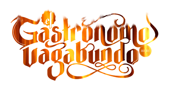
Context will give us a better idea of how this will be used, for example, this logo might look great big, but in smaller sizes the numbers and the "el" look like might be hard to read.
- Amicus0
Love the overall direction of this. What's the context?
The G doesn't fit with the rest so well. The 's' is looking better but maybe too tall. The 'r' needs to sit on the baseline like the original.
'el' looks too much like 'ef' and the '80|81' is too small. I agree with those who say you need to delete the 'G' and 'o' drop shadow thingamajig.
I love the style of the 'm' swash and maybe you could tweak it slightly and use a similar style of curve for the other swashes. I think its the more abrupt turns and the come and go I'm liking.
- doesnotexist0
that ligature coming off the 'b' is weird
- agree, should kill it. lovely mark thoBonSeff
- very nice yesdoesnotexist
- doesnotexist0
look at the negative space between letters- like the tr/gab area and the a/va. some weird happenings.
- set0
Its very nice although the 'G' , the 'el' and the '80|81' really don't fit.
- I agree about the G. Perhaps try some other approaches.luckyorphan
- scarabin0
it bothers me that only the G and the final O have that drop shadow thing on it. i feel like you should do them all or none of them
- luckyorphan0
Nice work. I had a few teeny tiny tweaks...mostly in the middle of the piece.
Before:

After:

Just my two cents.
- Other than the B's ascender I don't see what you did.i_monk
- the Sdasmeteor
- and some kerning.BRNK
- The ascender on the b, the descender on the r, and the s. And yes, some kerning.luckyorphan
- Download the jpegs if you like, and overlay one over the other.luckyorphan
- awak0
Like it a lot also.
-the 'el' definitely 'ef' now. Would there be any point on the 'el' styled like the swirly thing starting above the gastronomo's first o?
-the capital G looks like it is from another style. Clean it up or extend one of the swirls perhaps.
-would it destroy the n if the first stem would form an arc with the u? and then restyle the swirl a bit underneath...Good job anyways...hope to see the final outcome and the overall identity. Thumbs up!
- OSFA0
Very nice!! I like it a lot... minor tweakies...
- I'm not a huge fan of the Capital G... too much... clean it up a bit
- Ligatures could be smoother, play with them... I usually print and draw them until I am happy...
- lose the extra elements on the initial and final G and O
- n-m ligature needs some work, you have an extra peak there...
- definitely fix the L on 'el'... it does look like an FSee... minor stuff, but the logo is hot!
- i_monk0
bigtrickagain: R & BU - agreed; V is an issue, I don't want to push it (or -agabundo) too far down, and can't extend it any farther up, but I'll see what can be done.
bored2death: yeah, I've been trying different endings for the L, nothing seems right (or makes it even more like a script F); I see your point on the G, easily modified.
orrinwind: Inevitable. :)
Thanks all
- bored2death0
The connecting swoosh on the "b" and the "u" is just awkward to me.
- orrinward0
I'm surprised with the ability to create a logo that sexy you need us to flame it for you...
Well, I flamed it up for you anyway so here you go.
I want 20% though.
- SteveJobs0
The Vagabond Gastroenterologist
i like it
- grymes0
Just to say it. I dont think the depth thing you have going on the 'G' and final 'o' are working nor necessary.
- tasty0
is this for tampons?
- bored2death0
I like the way the line creates dimension on the last "o". I don't think it works as well on the capital "G".
- orrinward0
I bloody love it. I don;t like the 'el' or the '80|81' bit though. 'el' is hard to make out and the '80|81' doesn't tie in well.
I'd maybe consider making the bottom of the glyphs fit the curves under the n tighter, especially with the gAb and the DO.
Looks really nice though! Me likey!
- bored2death0
I wasn't sure if it was "ef" or "el".
- CALLES0
i like