Wes Anderson movie posters
- Started
- Last post
- 32 Responses
- inkpink0
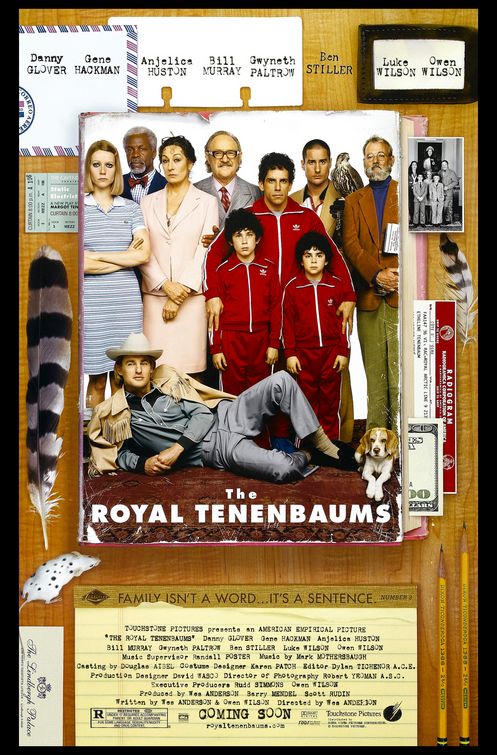
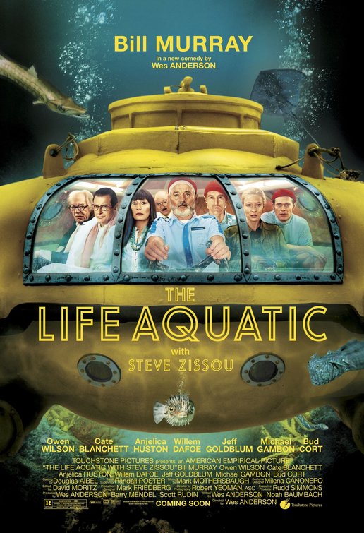
anyone else find the kerning on that slab "Royal" and "aquatic" very irritable?
- scarabin0
creating a print campaign for a film is so much more involved than just making a pretty picture
- juhls0
Ibraheem Youssef started his director series late last year. His Quentin Tarantino series is a lot better, but I dig all of his work:
- Bluejam0
the well of imagination has dried up
- babaganush0
They're very nice...just not very Wes..who I actually met in Soho and had a picture with like a giddy child...nice guy
- PIZZA0
very derivative
- ThePublics0
ZZZZZZZZZ.
- nikdaum0
I'm so used to seeing him use Futura, it's hard to not expect it.
- eighteen0
It seems a lot like designing a dvd cover for a Wes Anderson movie would be really easy because you've already got so much aesthetic bliss in the movies that boxset buyers will gobble up any mildly interesting color scheme cause that's what their into.
It's automatic coolness in theory except it's never actually a job it's just an overused portfolio stuffer.
- inteliboy0
these movie/tv poster remakes are getting a little stale - seems there is a new batch every week...
- SteveJobs0
nice, but yeah, i don't think they capture the essense of his films.
- stoplying
Saw these on Flavorpill yesterday. I like the simplicity of the posters, but not sure they are a good fit for someone like Wes Anderson who already has such a strong look to all of his films. Thoughts?