Best Movie Posters
- Started
- Last post
- 466 Responses
- scarabin0
you'll have to click this one as it's not really up anywhere but at imp yet

- antimotion0
Maybe not the best, but certainly interesting:

- Japanese B2 styleantimotion
- Home Alone vs Freddydopepope
- With all the 80s rehash stuff these days, that's definitely not out of scope haha...antimotion
- utopian3
- sick of these designer poster remakes - but this is greatinteliboy
- Some of the ones on the instagram are ok, but the They Live poster gives away the entire film.face_melter
- wowcruddlebub
- Milan2

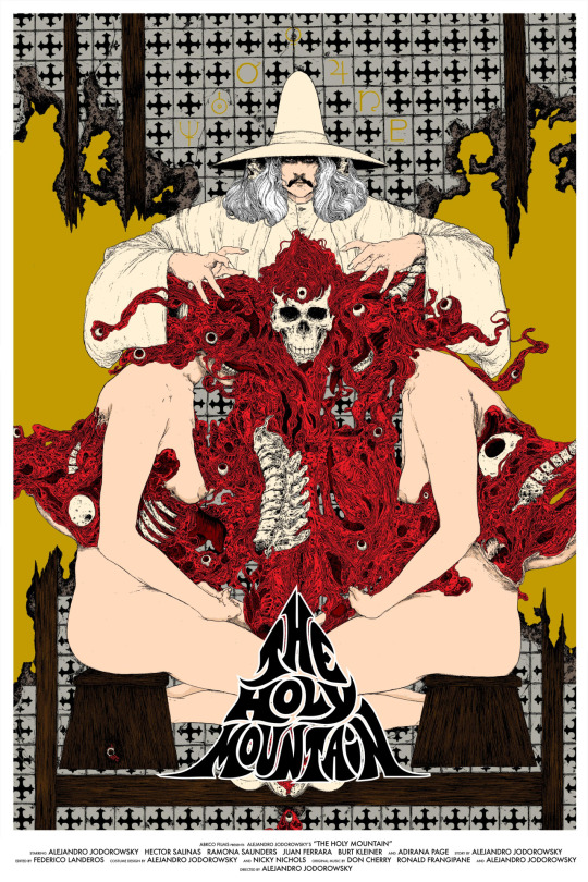
- The movie itself is insane. Go watch it if you haven't yetscruffics
- https://thepiratebay…scarabin
- face_melter0
Nice poster for a decidedly average adaptation


- du såg alla på bio?ArchitectofFate
- bara Jane Eyre. jag är gammal men inte så gammal...face_melter
- antimotion0
Some faves from http://www.filmonpaper.com/ - Great site for graphic inspiration
Boiling Point, directed by Beat Takeshi

Re: Scarabin's comment on painterly style - I've always loved this poster - so rich.

And also this Joe Dante classic

A wonderful shot here. The mood captured in a single frame - brilliant.

Another wonderful shot - so much power.

So dope


Walken with some crazy shit on his head - ya'll see this flick - freaked me out when I was a kid!


Nice airbrushing!

- scarabin0
- yiupjuanluisgarcia
- although the copy makes me feel funny inside being so close to the edgesjuanluisgarcia
- nb0

- the names should be switcheddeathboy
- contractual agreementsjuanluisgarcia
- This is actually extremely common in movie posters, I've noticed. To have the bigger star on the right, in the image, with the names not matching up.nb
- huh. just really noticed it on this one. id say fuck the man and switch it.deathboy
- http://i.imgur.com/7…nb
- https://uproxx.files…nb
- ah shit. well thanks. Now im going to see it on others and its gonna grind my gears.deathboy
- http://images.moviep…nb
- Yeah, it's something I've noticed since I was a little kid. It must be intentional, as most of the time you see two people it's a comp, right?nb
- You think they could just reverse the image if name order is contractual or something.qbner
- Right. I'm saying it's intentional. To have the names opposite the person. It maybe catches your eye?nb
- evens out the billingimbecile
- The client will check for the order of those names first before even noticing you had a sodomized nun in the poster.CyBrainX
- fadein114
I posted this pages ago but here we go again. THIS is a film poster. Art direction, typography, concept in relation to film. Timeless, powerfull and a perfect summation of the film. Fuck 99% of these illustrator fan posters - just not v.good. As someone who uses digital tools everyday its hard to say but I think its the computer that makes them so soulless and pretty bad.
Anyway, enjoy an example of the golden age of film poster.
- http://replygif.net/…juanluisgarcia
- type's too small, must be able to read it from 3 miles away /sGnash
- ^ downvoted comment in headfadein11
- the /s is code for sarcasm -- this is a lovely poster and the typography relicts the quiet terror that builds slowly in the film. love it.Gnash
- reflects*Gnash
- dopepope1
A lot of these are basically fan art movie posters, made after the fact, sometimes years later, and sold as such.Don't get me wrong, all of them are amazing, but they weren't used to advertise the film really. Shouldn't calling something a movie poster be an actual movie poster?
- all of them are not amazing... I agree.fadein11
- Poster for a movie = movie posteri_monk
- poster - [poh-ster] noun
1. a placard or bill posted or intended for posting in a public place, as for advertising.juanluisgarcia - movie poster = marketing for a film as opposed to nerd sat at home pleasuring oneself with Adobe software.fadein11
- vectorize a prop from a movie, slap a logo on it, collect FB likesscarabin
- fadein11-2
Funny,just been going through some of my fave films and I would say 75-85% have a terrible poster... including most of Scorsese's best work. Getting old now but for most of my life I have loved great film posters, so seductive when done well - part of the whole package / anticipation / excitement of cinema. A sign of getting old is saying how things used to be better but do you think film posters are quite poor these days? Not many great examples from the last 20 years, show me some.( and please no Adobe illustrator vector visual pun fan art)
- excuse my sentence structure... had a few wines.fadein11
- http://www.impawards… there boomArchitectofFate
- http://www.impawards…ArchitectofFate
- we're in a golden age of poster design, are you kidding?scarabin
- ^ the uber-troll strikes again... am I your next bully target?fadein11
- excuse me? change your tampon you sensitive fuck. all i was doing was praising modern poster designscarabin
- lol.scarabin
- browse through impawards.com, there are a lot more tools at our disposal than ever before and i'm personally digging the more painterly approaches being takenscarabin
- i am in full agreement with your take on the cheesy vector fan artscarabin
- fadein110
- https://upload.wikim…docpoz
- bahaha ^juanluisgarcia
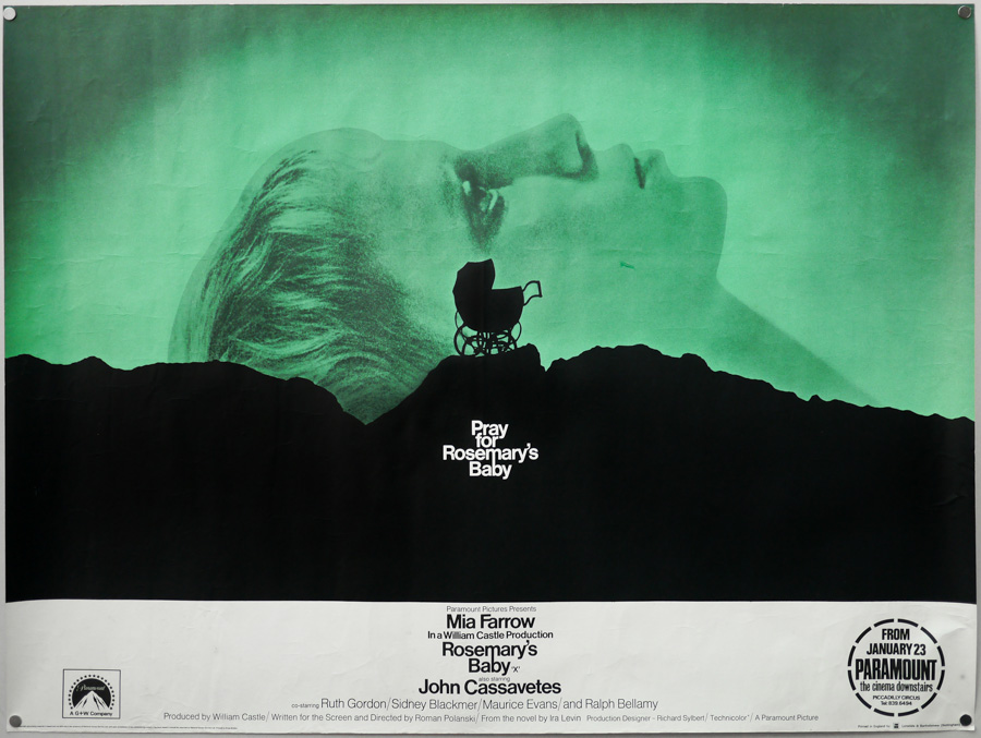
- this is recent (kind of) and sums up the film v.well methinks.fadein11
- antimotion0

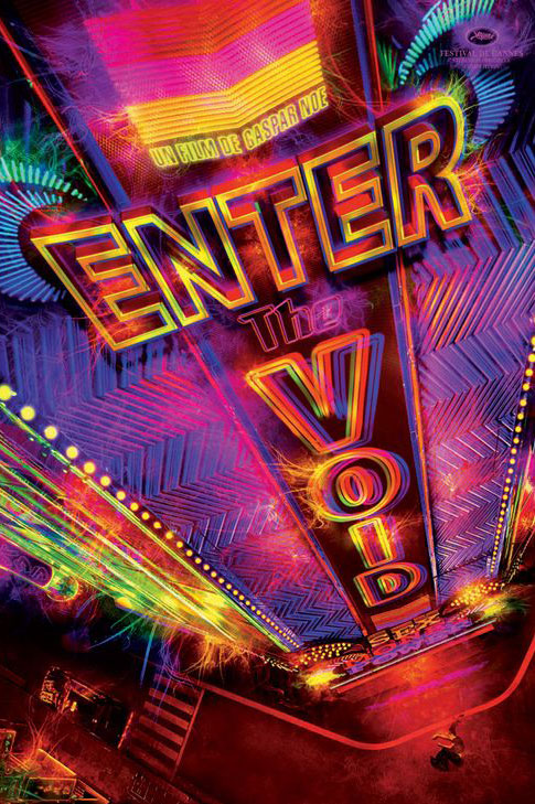
- New Gaspar Noe film!antimotion
- Cuming Soonbrandelec
- cripescruddlebub
- awful type but great imagefadein11
- not sure if arousing or gross.docpoz