Logo Crit Please
- Started
- Last post
- 52 Responses
- MondoMorphic
A client of mine is in need of a logo, so here's what I have for them.

For some background, it's a website from which users would type a comment, click Send, and the comment would be posted on all of their social networking sites, like Facebook, Myspace, and LinkedIn. The intent of this logo was to illustrate how ShareOne creates an interconnectedness between all of a person's (the star) online social networking sites.
- utopian0
nice
- rosem0
The idea is fairly first level, but I like the mark. Maybe try combining the arrowheads where they meet—they look a little thick right now.
- ********0
first thought was face first into the propeller.

- and that the balance between the mark and the type was wrong...********
- http://i253.photobuc…utopian
- not really... they bare more than a passing resemblance.********
- I always liked JK'sOSFA
- different business, different shape.. if you call that resemblance you can disqualify a lot more logo'sjanne76
- some people are so anal here about things you'd become paranoid of it.. jesus..janne76
- fucking hell janne, it was only my first thought... i didn't call rip or anything.********
- and that the balance between the mark and the type was wrong...
- Dancer0
^ skt is right but I think that may have something to with the colour.
Ilike the mark but needs much more refinement. Also the type is a little apologetic.
- ********0
any resemblance to other marks is a moot point anyway as yours, as read, is saying collate many into one, not share one with many. your arrows should be moving out from a single point.
- MondoMorphic0
Yeah, I'm sure there are bunches of logos that feature the shape of a star formed out of other objects. ;)
Dancer - what do you feel would make the type stronger?
- WeLoveNoise0
could spend all day on here posting star like logos. not the most original idea any designer has ever had but i do like your design.
it does reflect the company name well but i think the typeface needs alot more work at its not working well with the mark.
- and you could spend all day thinking the mark actually made sense.********
- and u cud shut the fuck up for onceWeLoveNoise
- oh dear, are we going to do this again... he asked for a crit, i gave my first reaction followed by a considered response...********
- response... maybe i should just stick with 'type needs work'********
- wasnt referring to ur crit - thought it was right. but combined with the company name i think the mark does make senseWeLoveNoise
- make sense.WeLoveNoise
- if it was for data aggregation it would, but this is for propagation, the opposite.********
- i thought i was just aggregation. in which case does need alot more work doing to it.WeLoveNoise
- and you could spend all day thinking the mark actually made sense.
- Mau0
Sheriff 1.5

- utopian0
What is really original these days anyway?
Everything has been done a gazillion times...
- MondoMorphic0
skt - I had thought about a reverse of the logo with the arrows pointing out but didn't like it quite as much. Let me dig that up. ;)
- Dancer0
ShareOne
Larger type
Less Contrast between the 2 words
Alternate font that has more gravitas?
- dyspl0
speaking of stars logo,
my favorite one :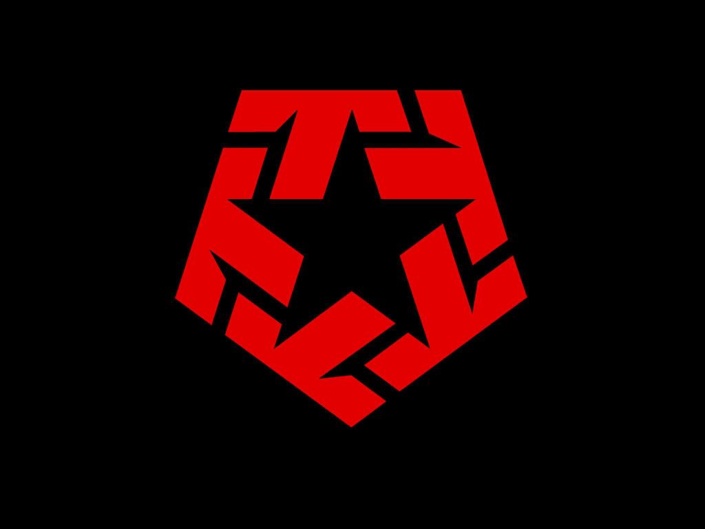
- ********0
aggregation: arrows in.
propagation: arrows out.with a bit of refinement it would be a nice shape, but like dancer says, what it communicates is king, not what it looks like.
- MondoMorphic0
Thanks for all the great feedback, folks.
What I didn't like about what the mark with the arrows pointing out actually was what it was communicating, but that's probably a problem with its execution.
- d_rek0
I approve.
(but being critical)
I think the arrows are a little heavy handed. The type doesnt' feel wholly integrated into the mark yet. It feels frail in comparison to the weight of the mark. It's a great start - after some refinement i'm sure it'll be great!
- luckyorphan0
How does it look when reduced? I wonder if you'd lose the arrows when it's 16x16.
- MondoMorphic0
The mark holds up pretty well when scaled down (which is great for a favicon), but the type is TINY.
- I have a logo, my full contact details and a picture of myself in my favicon.Nairn
- ********0
I think it doesnt look good. Very poor execution of an idea that lacks originality.
- Can you expand on that? Specific crits are usually preferred. Simply slamming something doesn't really help the designer.luckyorphan
- baseline_shift0
i think you are in danger of the points looking phallic.
- < that too.Scotch_Roman
- I was just going to say that. Take a few steps back from your monitor and you really notice it.rosem