Logo Crit Please
- Started
- Last post
- 52 Responses
- Scotch_Roman0
Really salisae? You're entitled to your opinion, but I don't think that's a fair characterization. I haven't posted up much work for critique here, but let's take a couple examples from recent memory. When I redesigned my business cards, a few people told me they thought the use of Gotham was old hat. I resisted at first, but ended up seeing the wisdom there and set the whole thing in Mercury.
I specifically used your recommendation about kerning in my logotype. After looking at it again I realized you were right.
When working on the logo for my church, I took so many criticisms into account that I can't even list them all here. Several QBNers were instrumental in steering me away from solutions that would've been too contemporary or too much like a golf course.
- i had no idea that you took anything into account. i only recall your resistance. my apologies._salisae_
- Scotch_Roman0
^ That being said sal, I'm well aware of what an insufferably stubborn bastard I can be. Sometimes I resist sound critique at first but then see the wisdom of it later on. And then of course a very large amount of critique coming from people on here is as useful as buttons on a handkerchief. All comes with the territory I suppose.
- utopian0
JourNYC = skt

- ********0
unlike you utopian i don't feel the need to sign up numerous fake accounts in order to rubbish other peoples work and call them gay (is there something wrong with being gay by the way?)
now if you think my contribution to this thread was born of hate, that's fair enough. it wasn't, but you're not very bright and entitled to an opinion.
now have you not got something to put at a 45 degree angle back in bum fuck nowhere?
- skt > http://files.getdrop…utopian
- skt - give "dickface" a whole new meaning!utopian
- oooh. zing.********
- and by zing i mean facepalm.********
- this is getting pretty boring by the way. i think i'm going to leave you to embarrass yourself.********
- utopian0
Hey Skittles, you should perhaps stick with your crop-circle threads and rounded logos.
- Taste the Rainbow.
- ********0
Yawn. Thx.
- sothere0
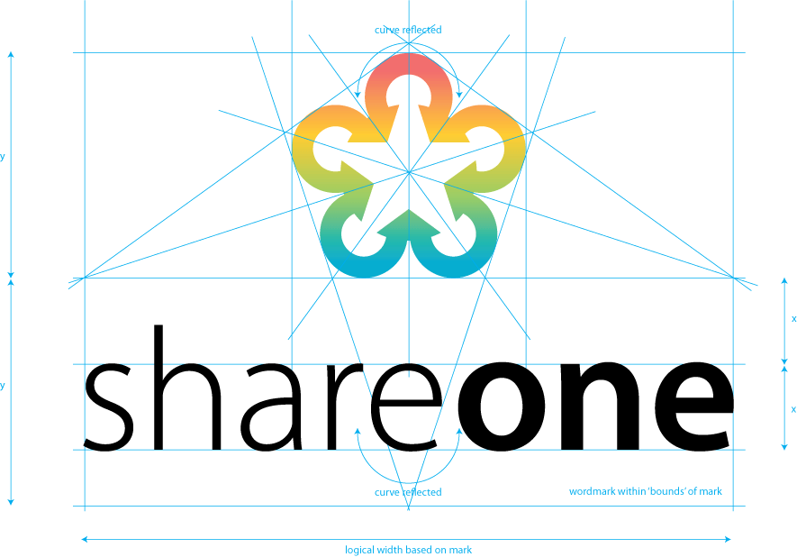
you're letters seem real spaced out and therefore don't conceptually work. Looks like from the mark you are trying to suggest a coming together. Then spacey type contradicts that idea.
- NONEIS0
Jour, I have to point this out, if you think you are surrounded by lesser souls, why hang out here? Your lack of understanding about the base importance of critique is telling, a good designer knows how to ACT on critique despite it's perfection or wisdom and willingly questions their own decisions in favor of a better solution
Yawn, put me in the pile, you just landed in ours.
- NONEIS0
In terms of the logo, sothere is on the right track. Tighten the kerning on "share" to more closely match "one", and you will be be on the right track. I would also consider the comparative scale of your elements a bit, print it real small and see how well each element stand up to the other.
- ukit0
haha I love how this thread turned into a fight between so many different people.
As for the logo, I had a positive impression upon first seeing it, but now that I read all the responses I'm not feeling so great about it.
- ********0
NONEIS you are awesome. I salute you. Do me proud. Crit away and make the world full of awesome designers like you!
- <3 Post your work.NONEIS
- <3 update your work********
- LOL, OK, a quick taste: http://www.commarts.…NONEIS
- Now wheres that folio Jour...NONEIS
- Nah, but thats pretty. SS is a good place to work with.********
- What, you can't show your work?NONEIS
- I'm gonna start making clucking sounds :DNONEIS
- No, most of my work is not done by me but some poor sad ADs. I can't call that my work.********
- Actually, I should say, NONE of my work is done by me.********
- Mmmm, so why the heavy hand with the young around here? I asked for a folio, not the work you are doing at your current employer.NONEIS
- job...NONEIS
- I dont have digital files friend. They are all paper samples that are fading away like my youth.********
- #13, what did I win?utopian
- unlucky streak?NONEIS
- You won 1st prize in the creative logo critic award********
- I am a winner, yahhh...utopian
- HahahahaNONEIS
- You sure are.********
- Did I win the Sheriff 1.5 Gold Star?utopian
- I will give that full 2 doodNONEIS
- neverblink0
Without going into the shape of the logo itself, (I believe it has been mentioned enough that the arrows should probably point outwards) I have made some visual comments on the ratio between the shape and the wordmark.