Poster Crit.
- Started
- Last post
- 36 Responses
- ukit0
^Yes, exactly. Wouldn't worry about the details until your message makes sense.
- dyspl0
to answer your question, about the text, I'd say that you could play more with the definition and the word "new"
Regarding to your definition, I would play with repetition : a font made from dot as you did. the same word again and again, but slightly changing along the differents words and so the last would finally be "NEW".
this is just an idea and there are many others.The general feeling I have is that you first focus on a meaningfull and strong message (as tDR used to do, and I know you like their work ), and then you try to make the whole thing looking nice, and that's where you seem to loose the path.
for me everything should follow the message, that's the aim of this kind of work, and that waht makes it "nice".just my 2cent.
- doesnotexist0
where's the concept?
- monospaced0
You need to get rid of the second "New" in the definition.
Decide whether you're going to use punctuation (periods) or not; There's a period after "New" but not after the definition.
Left-align the text better and make it much smaller.
I see a hairline gap between an ascender and descender. Fix it.I also agree that this poster is more about looking cool than actually promoting your work.
- rybo0
Cheers guys this is the response i expect, listen im young just need a bit of direction from time to time. all taken in thank you
- monospaced0
What did you learn from this?
- tank020
You should read that book that i suggested.
you got al the right elements and this book will learn a bit how you have to organize them...
- moamoa0
yeah rybo, listen to tank... very good book.
if you go shopping you should also grab this pieces.
use them as your bible.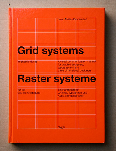


- typist0

- My E is better lolrybo
- you wishtypist
- OUCHdoesnotexist
- I've always hated this logo, despite the ambigram styleAmicus
- tank020
These book are manuals i still check when i'm designing.
These kind of rules work in combination with your own creativity.
- fresnobob0
Smoke Weed
- imnotadesigner0
kerning is horrible... looks like you tried to make it tight but its just not done properly
- rybo0
any more feedback?
- leewilson780
you need to read up on geometry and white space.