Logo Crit
- Started
- Last post
- 33 Responses
- D_Dot
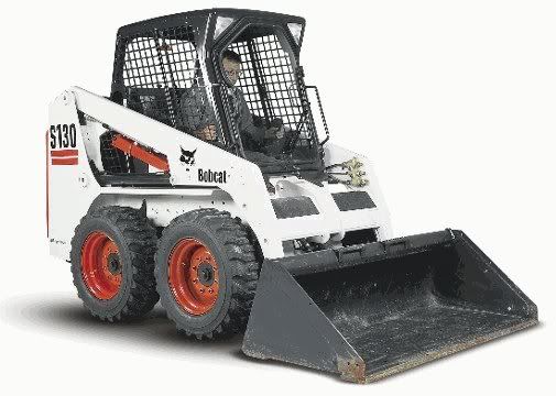
Friend of mine just purchased a bobcat and plans on offering his services to small contractors as well as snow removal in the coming winter. He asked me to make him a logo and business card to hand out. I'm not charging him anything except a few winter storm driveway clean-ups. Does this logo convey what I've described?
Thanks.
D_Dot
- ********0
totally weird for me
- non0
hmmmm...
- Spanna0
nope
- non0
work on the K. It looks cheap and made in about 10 seconds.
- sleepyfatso0
Yeah, the K needs some work to make it look more professional.
- Knuckleberry0
me no likey
- gramme0
Start over. Sorry to be blunt, but that's ten kinds of wrong. Show us some options.
- Nairn0
If skid-steer means something to the target audience then yes, I'd say focus on the form of the K a little more, and you'll have a more than acceptable freebie logo.
- locustsloth0
i think it's good. Looks more professional, a lot like the logos of construction equipment, instead of cute or gimmick-y. i wouldn't get the whole K being a plow thing if you hadn't described the service, but i suppose people using the service will know what a skid-steer is anyway. Colors are nice too
- bulletfactory0
coming from a construction/excavation family - this looks like larger machinery (ie: dozer) not bobcat or other small skid loaders.
- WeLoveNoise0
sorry d_dot but that K is insane - not keen on the design
if i had the time i wudnt mind doing a design cos got a couple of good ideas floating in my head.try playing with skid marks more
- the orange accender on the K is the wierd partWeLoveNoise
- dirty underwares?gramme
- i.e. skid marks...gramme
- lolWeLoveNoise
- Have at it. I'm always open to new directions.D_Dot
- ********0
i think that it works for the kind of company it is. this totally reminds me of a BOBCAT logo or something.
i'm not loving the font or the placement of the tag-line under neath. maybe it just doesn't need it.
- citizen_h0
keep the idea but just work some more on the execution
- ********0
as for the K, i think it's spot on. it looks JUST like the front of the machine. lighten up the stroke on the circles and it might not look so "done in 10 seconds"
- OhYeah0
Skid is shit in Danish :D sorry, no I don't like the "K" at all, this needs more work. I don't mind the font for the rest of it.
- ********0
not much more. logos for these kinds of companies tend to be very minimal. blocky. easy to read from a mile away.
- SigDesign0
Yep, K needs some work...
- D_Dot0
I was having problems simplifying this style of loader.