Logo Crit
- Started
- Last post
- 33 Responses
- konqa0
the K. looks suspicious..
- D_Dot0
Whoa!
Actually he was happy with that one, so I let it be. I've already had him clear my driveway twice since then, so it was worth it.
- gramme0
Slow times at Ridgemont High, eh WeLoveNoise?
;)
- WeLoveNoise0
lol just remembered
i wanted to know how it turned out [now i have down time n'all]
- WeLoveNoise0
how did u get on with this mark d_dot ?
- MikeJ0
I dont feel like dancing
- gramme0
You know the sort of letters I'm talking about? Super thick, geometric, filled-in counters. But instead of filling counters you could separate letters down the middle, as in knocking out a space down the middle of the capital U in KUTRITE.
- Yeah I think it's a great Idea. I'm going to play around with it later today. Thanks for the help gramme.D_Dot
- non0
I think a strong typographic logo would do the trick. No need to give a visual hint if the service he offers is written under.
- gramme0
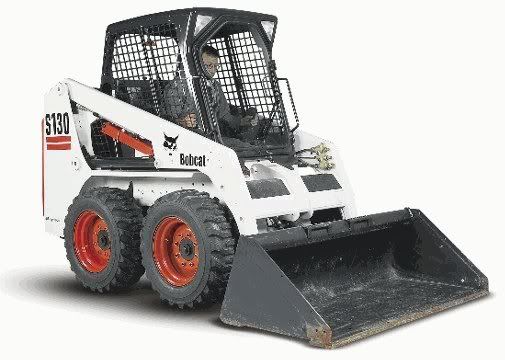
Another thing you could try is to draw blocky, stencil-ish letters where the K is made of a thick vertical rectangle and two triangles, then make the other letters harmonize in style. I usually hate the neo-geometric look, but the forklift in that pic has some strong geometry to it, especially the orange bucket which is a triangle in profile.
- I tried making a K by mirroring an outline of the loader in profile, but it looked odd. maybe I should revisit...D_Dot
- WeLoveNoise0
whens ur deadline for it d_dot ?
and is it freelance ?- I have a while to get it to him. and it's for a friend so he knows I'm busy with my 9-5D_Dot
- gramme0
I disagree, I would totally re-draw the K. It's too curvy and bears no resemblance to the rest of the logotype. The idea isn't too bad but I think it can be subtler. In fact, I think all you might need is to make the arm and leg of the K be separate (using a typeface like Univers where this is already so would help) and make the arm/leg shape orange. Ken ye?
- D_Dot0
I was having problems simplifying this style of loader.
- SigDesign0
Yep, K needs some work...
- anxiousarms0
not much more. logos for these kinds of companies tend to be very minimal. blocky. easy to read from a mile away.
- OhYeah0
Skid is shit in Danish :D sorry, no I don't like the "K" at all, this needs more work. I don't mind the font for the rest of it.
- anxiousarms0
as for the K, i think it's spot on. it looks JUST like the front of the machine. lighten up the stroke on the circles and it might not look so "done in 10 seconds"