NEW Pepsi Logo
- Started
- Last post
- 76 Responses
- doesnotexist0
looks like a store brand
- sureshot0
bleurgh
- SigDesign0
ugh.. I hate it... why change the Pepsi logo structurally? It's great how it is...
- its called rebranding, and it aims to keep the mark contemporaryMeeklo
- looks like they missed their aim and hit SOMEONE else's logo.anxiousarms
- Yeah, but isn't re-branding supposed to produce a better logo?SigDesign
- Meeklo0
props for not being plastic, or have a reflection
- digdre0
it's just a marketing flip? ah hell, I thought this was fo realz
- horton0
am i the first to say i really like it... ?
- yes. what do you like about it?dirtydesign
- haven't read teh article, just my initial reaction it seems like a good move fwd.. and i like the smile concepthorton
- its progressive for them yet still recognizable, and its flat and clean.. no horrible web 2.0 effectshorton
- the old wavey line had no personality... this is youthful which is what pepsi is all abouthorton
- I can respect that opinion. The only place I saw this working well was TV/animation.dirtydesign
- eating_tv0
I'm starting to believe this is a hoax and we're all falling for it hook, line and sinker.
- moamoa0
ehmmm... NO
- Fizik0
without that swirl thing in the middle, it's too much like some other 'blue/red' logos ......totally lost the familiar brand there....damn .....of all the things to mess with .....
- dirtydesign0
It's certainly not a hoax. You'll see that on pack in January/February 09.
- citizen_h0
needs lens flare
- Complexfruit0
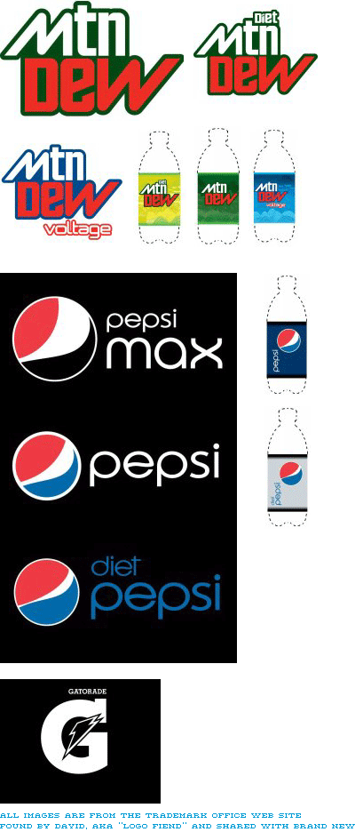
Taken from http://www.underconsideration.co… on Pepsi's new redesign. "Now, this doesn't mean it will all be used or that this will be its ultimate form, but if it's been registered or trademarked it sure won't be too different."
- yup i like it, nice touch on the "e"horton
- dear god. whos is doing their design? the CEOs kid whos in design college?sofakingbanned
- I think the Mtn Dew logo works, since they gear it towards the extreme sports demographic. I'm not sure about the other though.Complexfruit
- ...logos though.Complexfruit
- horrible font on the pepsi one, I do not like that bauhaus stylee 'p'.ian
- Ampersanderson0
Totally hate it.
- anxiousarms0
i don't get the point of abbreviating Mountain. were people having trouble with it?
i really hate when cell phone or IM typing shortcuts find their way into the real world. it's fucking ghey.
