Logo Crit
- Started
- Last post
- 80 Responses
- dirtydesign0
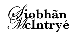
Does look like a florist. Not diggin the font.
- ********0
this guy again? Dude, get the personal projects out of here.
- rybo0

- rybo0

- chossy0
are you sure you spelt her last name properly?... seems well weird spelling to me yo!,
- dirtydesign0
Just curious why a script font is necessary?
- rybo0
Script font portraits elegance and beauty
- no!moamoa
- Guess it's subjective, but serifs and sans serifs can also reflect that.dirtydesign
- moamoa0
hey rybo...are you serious with that?
listen to the guys here.... we give you some advices.. and you come 2 minutes later with a new design....
your first try has nothing to do with FASHION... .NOTHING!!!!!!!!
- brains0
If her work is all floral / decorative.. why go down that same road? It would stand out much more to have a juxtaposition or some sort of contrast between her identity and her clothing.
- dirtydesign0
Might be worth a shot to try the floral element from the first round with a simple type treatment. Serif or Sans.
Otherwise, take a look at more script fonts.
- moamoa0
- the kerning on bottega veneta is haggard huh?dirtydesign
- indeed :) shame on themmoamoa
- bulletfactory0
experiment w/ serif; class and strength.
- ********0
get this personal project out of here.
- spookykat0
You guys are pretty harsh critics lol
- rybo0
spookykat i ask fro crits most days, the thing is though i have loads of work i get numerous emails daily...and anyway i can take it, if these lot want to make there dicks bigger let them
- uncle_helv0
rybo... maybe you should try a new career, this one is clearly not working for you, plus your attitude sucks, but my hunch is you are just a troll, spewing out rubbish in the PV knowing full well people are gonna rip the is shit into it, as i don't think anyone is this stupid!
- ********0
who knows? maybe the client wanted a script?
- I blame most of my shit designs on the client********
- hahhaamoamoa
- I blame most of my shit designs on the client
- ian000
I concur with moamoa. The script face feels all wrong - doesn't feel fashion at all. This floral illustrations could be interesting if they were developed more and integrated with the logotype.