Logo Crit
- Started
- Last post
- 80 Responses
- ********0
to play devil's advocate... why does a fashion design have to "feel fashion"--isn't that just another way of saying imitative of what is expected?
- ian000
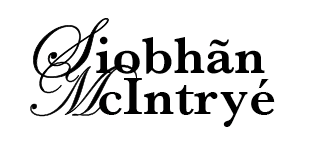
maybe so. but I can't get over how wrong the script feels. it's neither elegant nor pretty in my mind. it feels cheap and dispensable.
- I don't like the script either, I was just sayin...********
- I don't like the script either, I was just sayin...
- moamoa0
I think there is not a real NORM for a fashion logo... there are some in didot, gotham, engravers, and also in helvetica like FENDI, but the feeling has to be fashionlike... you work mostly pretty minimalistic in the design, & in this minimalistic case you have to transport it... and when you don´t have that, you can´t transport what you are... imagine a ad photo from gucci or vuitton with a general electric logo.... = message failed..
oh my english is so bad at night
- gramme0
Rybo:
Spend a couple weeks on it then get back to us. If the client can't wait that long, fire her. Proper logos take time. You can't just typeset something without giving thought to kerning or even spelling, then just slap it up here and expect serious critique.
Take moamoa's advice. The guy has done a lot of very elegant, classic work for people in the fashion biz.
Finally, your attitude is awful. A bit of humility is in order if you intend to solicit honest critique from any of us.
- thanks gramme.
I don´t think he will listen to you, I lost my hopemoamoa
- thanks gramme.
- ian000
rybo, I have found that in order to have a successful crit it is best to present several options. To me, the 4 options you are showing are sketches of one idea. Refine that idea into one look. Then pursue 3-4 new ideas. Once you have a nice set of ideas throw them up here for a critique. I've found that people are very willing to give constructive critiques. You just have to do a little more work first.
- monospaced0

- nice integration with the flourishesmonospaced
- double lol....moamoa
- hahahaian00
- ********0
This guy has some really nice fashion branding, check it:
http://www.marcatlan.com/menu.ht…- jap.. I also wanted to show his link.. but forgot the urlmoamoa
- rybo0
I dont get why my attitude stink? iv not bitten at anyone, and i won't be looking for a new career this is the career i want so i will get in, im not some micky mouse designer,
I have a triple distinction BTEC and headed the same way on my HND, my clients are always happy with what i produce and im a chilled out lad but i must come across as a right tosser on here.
but from my point of view each time i post a crit a couple of normal down to earth people emerge and the rest of the people trying to make there dick bigger rear there head as usual
- klu0
#2
i like the symbol.
maybe play up that, and less Edwardian Script
- rybo0
Less script
- klu0
nice try. now it has no 'identity'... looks too generic. u have any other script choices?
- elpaso0
you DO know that when you add accents - it CHANGES the word?
right?
it's not just a style accessory??
its like going from being called Ryan to being called Ri-anne
- Jnr_Madison0
Oh God, I just found pics of rybo..
- JG_LB0

- where can I buy?moamoa
- I got boxes of them in the basement!!!... mail me coz I don't know what to do with so meny of 'em!!VectorMasked
- moamoa0
guys can you post this stuff in this thread ? fits better :)
- JG_LB0
i'm on rybo's side. he was just looking for some constructive feedback...

