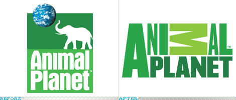
horrible Animal Planet logo
- Started
- Last post
- 27 Responses
- _salisae_0
Looking at the logo within context of their web site I feel it's a success. Identities must be identifiable, as well as it looks good alongside the animals.
Oh and I disagree with everyone. Hi.
- but shouldn't it also work outside of the context of their site? It just horrible everywhere elsePoint5
- Point taken. Therefore ranks with 'The planet's funniest animals' as the low-rent destination for animal lovers.babaganush
- doesnotexist0
it looks better in the subway ads here in the city. I don't like it in the green color, don't mind the M either. I actually kind of liked the mark when I first saw they had redone it.
- 5timuli0
"as it attempts to shed its family-friendly image for a more intense experience"
What the fuck is going on with these TV fucktards? They feel they have to pander to the lowest common denominator... they did the same 'rebrand' with Court TV (now Tru TV), ruining the channel in the process.
- 5timuli0
Actually though, the logo is growing on me.
- Resist! the M is wrapping iself around your creative windpipe like a Constrictor!babaganush
- kult0
The logo hasn't grown on me at all.
The crappyness of this hits much harder because I freaking love Animal Planet. I can't endure being attacked by this logo much more.
- cotton0
It does get that jungle feel across without having to think about it.
Too bad the channel should be called DogPlanet.
- 7340
i guess it will depend on how well they execute the branding
never cared much for usa network new logo when it came out a few years back... but the branding was exceptional. grew on me after awhile
- b_magallanes0
I think its supposed to represent tiger stripes.
- Ampersanderson0
"The new programming on Animal Planet will tap into the instincts that drive us all — fear, hunger, pleasure, nurture — with compelling stories that resonate with what it means to be human."
- sea_sea0
yup, some kind of stripes.
- Drno0
MAKE THE LOGO BIGGER GODDAMIT
- Point50
thanks Ampersanderson. I knew there had to be something out there that reviewed this.
"Regardless of what typeface it is or isn't, the logo is a weird jumble of ideas. I am guessing that the varying widths of each letter represent the different animals, that the sideways M could be an animal in a different position (I would gander sleeping or ready to fornicate), or maybe it's a bat, and that the overall composition is meant to feel alive and unexpected. Unfortunately it feels mechanical, constricted and, well, dead. For an identity that strives to "bring out the raw, visceral emotion in the animal kingdom" this simply does not cut it."
glad I'm not the only one that is disturbed by this thing. I usually don't rant about things like this, but Animal Planet is a channel I watch on occasion and this logo actually deters me from watching it anymore. It irks me to no end.
- uncle_helv0
They are both shit...
Point5 what the fuck are you on about??
- utopian0
It looks like a "zoo exhibit" logo, bad design. I'm surprised they did not throw-in an Apple stylized reflection, drop shadow or a web 2.0 3D gel like typeface...
- rtr0
all i think of when i see it is "I better turn AZN off"
- ukit0
My god, that's the worst logo for a big company I've ever seen, hands down.
I'm just in awe of how bad it is.
- brains0
holy jesus. fouty's return!
- ukit0
Victoria Lowell, Senior Vice President of Marketing
"Animal Planet has commissioned a new logo to signal its change: the name of the channel in different size letters, made to look as if it could have been created by an animal, Lowell explained. On TV, the logo will come alive with an animal emerging from the "M." Animal Planet is working with London-based design agency Dunning, Eley and Jones on the new logo and look; and Minneapolis-based creative agency Mono on the marketing campaign."
- utopian0
Must be... the same designer of this hacked London logo below, what happen to UK design? Did crack invade London?
