Show some recent work
- Started
- Last post
- 8,593 Responses
- JG_LB0

new poster I designed and photographed. you can see more on the project here: http://juanluisgarcia.com/portfo…
- ptouch7180

- interesting work...utopian
- spanks, they are random google queries combined.ptouch718
- huh.Ampersanderson
- son0
- nthkl0
Not really for anything work based, just trying to learn C4D a bit more on my free time...

- radinstrmntl
- Love it!FallowDeer
- Thanks guys. I wanna setup a camera spline to render this weekend.nthkl
- i wanna see this hi-res. nice work man!fugged
- awesomeJaline
- will it move?Miguex
- Nice! I agree - it would be cool to see some hi res.yar
- IIt's rigged with bones to animate now, just gotta get around to it one day. It'll render at about 1280x720. Each frame takes a minute or two to render with GI cranked.nthkl
- takes a few minutes to render with GI and Ambient Occlusion cranked.nthkl
- SigDesign0
whoops
- Meeklo0
T Shirts and product shots
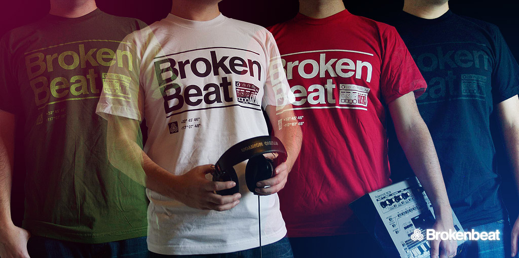
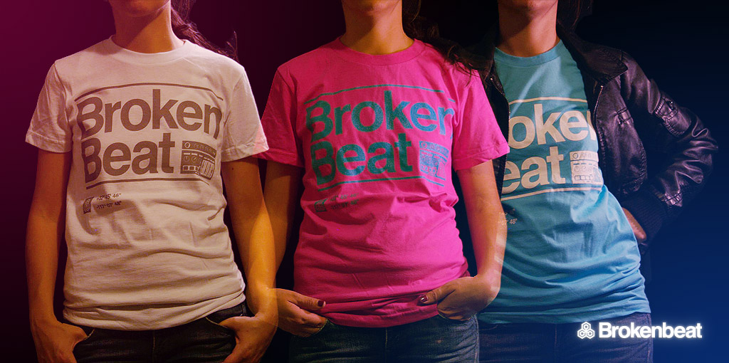
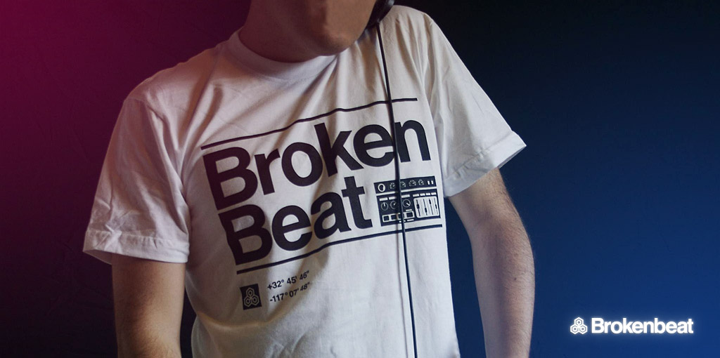
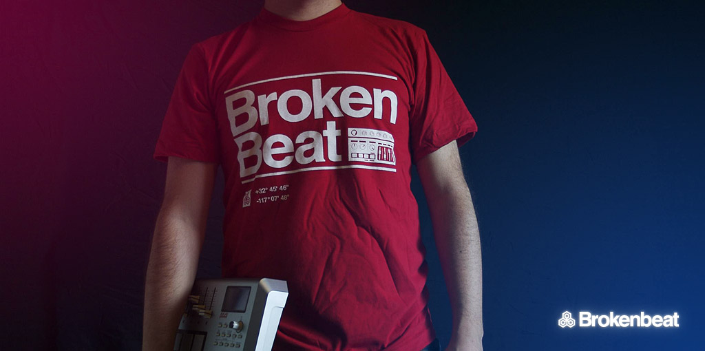
- the dudes are a bit "transparent".akrokdesign
- just like their intentionsMeeklo
- nice! I'll take a white one .. Is that an mc303 i see?letterhead
- I like it.Iggyboo
- you are correct!
It cost me $800 waaay back in the day, today its worth nothingMeeklo
- dibec0
a sample of my work flow for photography.
Straight off Camera on Left (SOC) : White Balance on Right

Photoshop mega tweak. 20 Layers focus on clarity, color, composition, and contrast. Still Work in Progress. This is a 4 panel print I am doing for the office. The print size is 21(width) x 14(height) inches.

- incredible7point34
- you better go back to that spot, spit on your lens and take the picture again. less work, same result.stewart
- It would not have the same effect. The spit bubbles would create a fish effect distorting clarity. =Pdibec
- hats off dibec - this is very nice worksikma
- holy shizzledigdre
- Thank you. =)dibec
- hellojeehae0


type didn't come out as well but it was tiny and i used a yudu machine for screenprinting.
- Christmas cards for this year for my friends and familyhellojeehae
- mydo0
11 presents!
- loool0
book about no signal symbol...
- max_prophet0
The logo looks much better now.
What I don't like about the ad is that it communicates nothing, I am none the wiser, I've never heard of the product and all I know is that it's something to do with digital publishing. And that generic people in generic stock images might use it in their lab/apartment.
I really think there needs to be some kind of headline probably indicating trhe products USP outlined in a quick and obvious manner, at the moment there is no hook to learn more and it just looks of no interest to me who may be flicking through a magazine.
"Go beyond print" - great, but tell me in a flash not a series of minute bulletpoints and text that all happens to be made quite illegible thanks to complex background graphics.
I think you've done what I would call a 'design job' on this, in that it looks quite pretty and sharp, though in a sterile and somewhat cold manner, but you've forgotten to unpack what it is you are selling, and have ended up delivering very little information, unless someone actually stops to read the small print, which they won't.
- for kelpie, hope that doesn't sound too harsh.max_prophet
- you are, of course, completely correct. Unfortunately my hands were pretty much tied on this one. cheers mate.kelpie
- aah well, what can you do.max_prophet
- oops - sorry for bolting in :-pinvisiblechamber
- that logo would look nice animated btw. it reminds me of one of those film/production companies.. with the paper curling into a C or sthmax_prophet
- curling into a C or sthmax_prophet
- probably communicate your points to the relevant parties next time, I'd reckon. education education education ;)kelpie
- hehe, no problem invisiblechamber...
yeah max, I'm looking forward to animating these (its part of a suite of 3 products)kelpie - ...suite of 3 products)kelpie
- mg330
Finished Expedition Bureau Issue 8 last week, and launched a new portfolio site for my own photography. Busy week...

http://www.expeditionbureau.com/…
www.michaelgallegly.com- great stuff!cbass99
- Thank you!mg33
- Nice work! On the portfolio the menu hides behind the MICHAELGALLEGLY.COM text..set
- I like the name Gallegly. It's like a Scotsman saying my name Gregory hahaset
- (on mobile the menu hides behind the text, I meant)set
- nice Mike.organicgrid
- Thanks again guys! Set - what browser are you using?mg33
- Chrome
http://i.imgur.com/X…set - The CSS has some odd behavior in this WP theme. On a mobile device, that doesn't happen...mg33
- But sizing the width down on desktop to mimic a mobile device doesn't engage the actual mobile CSS in the same way. It's weird.mg33
- Thanks for looking and for the screenshot set!mg33
- Nice!
OSFA
- where_am_i5
Here is another one in the frame-by-frame experimentation series. This was a combo of PS and Animate and as always finished in AE.
It's of Kelly's perfect 10 at Backdoor. Check the insta for better qualitaaay and sound ;)
https://www.instagram.com/p/CSs_…
- molo0
http://www.flickr.com/photos/dan…
frame from a 10 sec. animation for me...well my studio. i'll post the full thing soon.
- MrOneHundred0
I did this today. Let me just say, I am not an illustrator as such. It’s a character which is supposed to represent “sustainability”. Note, in Australia we have different light globe fittings (yes, it’s a compact fluorescent globe). Any comments, apart from “it looks like an ice-cream” or “don’t give up your day job” are welcome.

- I would consider this 70% done. The bottom half needs help, and the shading concerns me...MrOneHundred
- i like it doh. one thing to think about how small does it need to be scaled down too. make sure it works, tiny also.akrokdesign
- is that an electrical mr whippy! rockin'.airey
- I think its good, I'm more of a screw type than bayonet man myself though :)slappy


