Show some recent work
- Started
- Last post
- 8,593 Responses
- vsplus0
Finally updated my website with lots of illustrations :)
papercut.fr/2013/01/real-simple2...
papercut.fr/2013/02/real-simple...


- links: http://papercut.fr/2…
http://papercut.fr/2…vsplus - joli!dyspl
- Mirci :)vsplus
- +1Complexfruit
- Very nice mateset
- LovelyJerseyRaindog
- links: http://papercut.fr/2…
- SigDesign0
Motion graphic art direction for an adidas video

- bumdrizzle0
jesus daven, do you just never learn? it doesn't matter how many times you get caught for copying work, or outright stealing images (as above) you just keep doing it.
- yup, if I was DP Kaufman and I found out where the boy image came from I'd be pretty pissed.Amicus
- mydo0
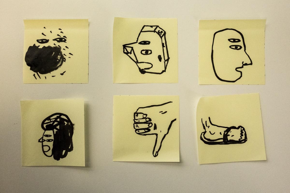
and made this
- want one!!!!!dyspl
- threshold + halftone ?WeLoveNoise
- about 6 hours in illustrator pulling apart traced images. deleting the bits i didn't need.mydo
- very cööl!akrokdesign
- Very cool x 2.JerseyRaindog
- nice, mydo! love it!Chief
- Really nice!yar
- thanks guys!mydo
- Please do me a T shirt, Pleaseroundabout
- kodap0

cheesy but so comfy
- FallowDeer0
Quick logo design for a gastro pub, I love it to bits haha but client didnt, might work it up for the portfolio tho

- that linespacing, tighten it up matedigdre
- haha I was wondering how long it would take someone to comment on my typography :)FallowDeer
- hahahadigdre
- not that i'm a pro...digdre
- well I dont know much so all the help is good!FallowDeer
- what about an ampersand rather than the word 'and'?airey
- nice !
one thing : yo ucan notice ther's still the a line before the n. due to kerning I guess, yo ucould custom that :)dyspl - yeah ive spotted that as well, ill work it up for my portfolioFallowDeer
- could use a lot of work. no personality, no brand positioning. its gotham and some script.noRBG
- upper right one has potentialAnders
- It's not Gotham it's Akzidenz. Top right could be a winner with an ampersand in the script face, tighter leading.Ampersanderson
- ideaist0
Day & night in my village of Creemore, Ontario, Canada; illustrated by my girl, design & developed by yours truly.


"We are very proud to release Our Creemore (1.5). This project for Creemore’s Business Improvement Association (BIA) will become an organic force as we release seasonal skins, integrate events & happenings with the recently released The Creemore Echo and of course, the site will always reflect reality in our lovely village moving forward; if a merchant paints their store front a new colour, it will be reflected on the site (as fast as Ruth Ann’s hands are able to illustrate)."
- tank020
rush job for delvaux, the lookbooks
already incorperates a part of the rebranding i think.
nice people there btw...


- ohh I am working on a redesign for a fashionlabel, and they also have a crown.. NICE JOBmoamoa
- niceJaline
- digDr_Rand
- very nice!joqui
- Love the type, dude.Ampersanderson
- which font are you using on the details? beautiful!!_salisae_
- thats garamond premiere pro.
paper is conqereur absolut matte.
tank02 - cheers! the delvaux logo is so nice with that type._salisae_
- d_gitale2
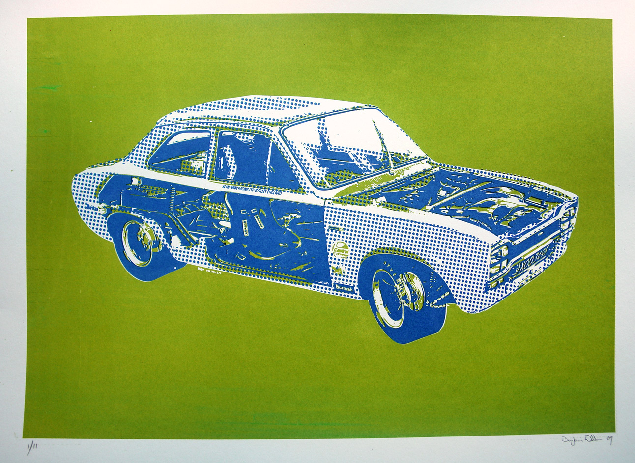
not really recent, graphic is from a few years back. But I have just put in on shirts (dtg print on demand)

- jensmens2
inspired by classic paintings, i made this triptic for an assignment on a world without fossil fuel

- hellobotto0
A humble personal series of abstractions which started as a non-design distraction. Decided to turn it into an ongoing series online. Going to try to post daily. http://thatsmallmoon.tumblr.com
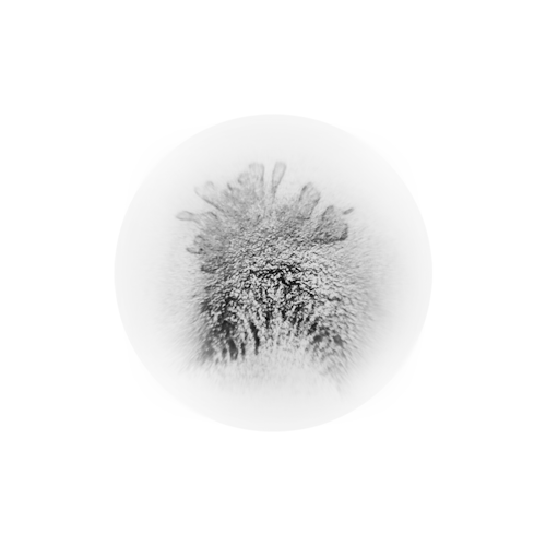
(or maybe it's just a sign I've been listening to Kraftwerk waaay too much of late.)
- RumperChunk0
Try this..

- "challange"? on purpose?dyspl
- good spot dyspl!
challenge* :OHombre_Lobo
- twokids0
Something I did pro bono for a water charity. They decided not to use it because they wanted a realistic 3D character, which I thought was a mistake