Show some recent work
Show some recent work
- Started
- Last post
- 8,593 Responses
- invisiblechamber0

- logo redesign based on their patent: http://invisiblecham…invisiblechamber
- really nice.skt
- is it not the wrong way round though?skt
- yes but hey :)invisiblechamber
- approveddigdre
- Depends which way you're facing, skt :) Typically nice work, invisi!Nairn
- thankyinvisiblechamber
- nice!jiaf
- nicejuhls
- jellofunk0
I had this illustration idea and then added the krylon logo for fun..

- jkmohr0
bought an old cabinet at goodwill for $3. sanded it down, stained and painted it to match the rest of my stuff. using it to store print supplies.

- joyride0
- I like it for some reasondigdre
- very well done :)WeLoveNoise
- moamoa0

- HelloDog
(needs more neon)kelpie - clean, sleekdigdre
- needs pixel fontsSillyBilly
- needs underlinedigdre
- I think the image cropping should be a bit more daring / unconventional .. I think the left body area is redundant, i'd either chop it or extend it if you have more dog availablelukusW
- either chop it or extend it if you have more dog availablelukusW
- leave the dog alone.digdre
- this is not a crit thread folks - you must nothing but flatter here.invisiblechamber
- mabe you could shop me into it.digdre
- yeah shop digdre into it and a goat. then add some magenta. make the text bigger, add a diagram.jimzyk
- DONE.jimzyk
- great the way it is.Jnr_Madison
- Nice Balance! The dog seems really interested in the comments.jiaf
- HelloDog
- WeLoveNoise0
currently working on a new ident for marketing/pr company
still needs shitloads more doing to it though
- prob shudnt have posted so earlyWeLoveNoise
- what letters are those?digdre
- chi
the newer version has gap between c / h + touched up on kerning and ascender on the hWeLoveNoise - yea, remove the line that connects the CH down theredigdre
- ouch! what's your idea? nothing wrong with the existing one. this one is somehow the same, but illegible.stewart
- http://www.chi-neder…stewart
- digdre0
- really like this digs, nice onekelpie
- nice one... not so keen about about brushesmoamoa
- sweeeeeet {shit band tho}WeLoveNoise
- nice.akrokdesign
- What WeLoveNoise said.JerseyRaindog
- Dig, I like, but you're on a massive poster bend. It looks like you've referenced every notable poster shop there is.Ampersanderson
- i don't know any poster shopdigdre
- neverblink0

- woa woa :D awesome, you should vectorize it into this style http://ffffound.com/…digdre
- or this: http://ffffound.com/…digdre
- I'd like to think I have my own style ;) -- Might be exhibiting this stuff in the near futureneverblink
- ok ok :D i said nothing. :Ddigdre
- haha.. Ik kan wel tegen wat kritiek hoor Tom ;) -- maar vind de stijlen die je postte niet "mij"neverblink
- digdre0
- alter lego...neverblink
- no shit :Ddigdre
- I like it, but would'nt it be better if one of the lego heads had an evil face?non
- super lego and clark 'lego' kent?Amicus
- one of alter ego has glasses.digdre
- this is close to perfect :)SlashPeckham
- thank youdigdre
- m_h0

- marindsgn0
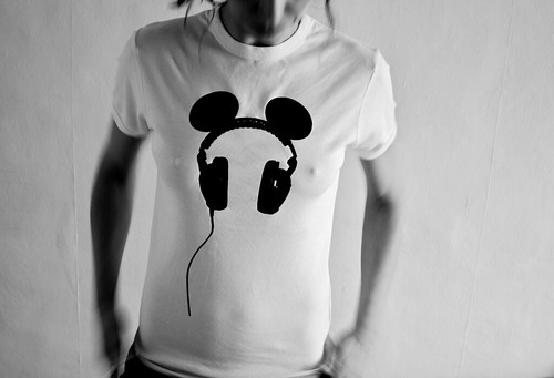
- more nipples!marindsgn
- +1wordsinyourmouth
- for nipswordsinyourmouth
- aliasimaging0
- Those kid shots are beautiful - nice work! SIte layout could use some love - a bit more space, stronger grid allegianceNairn
- thanks for the feedback, working on the site and hope to have it tightened up by end of nxt week.aliasimaging
- marindsgn0

- Nice! Why not make the cord go to the bottom?Ravdyk
- the nipples look great, well done..neue75_bold
- Ravdyk0

My intern report
- digdre0
No idea if it already exists.. but I based the style on the current 'concert poster style'
pretty basic and simple

- nice idea. bold needs more bold.invisiblechamber
- Bold does need to be more bold.
There are probably more ways to do this, but it would've been complex. Nice job.juhls - Nice Tom! Have you tried without the outline or individual outlines on each one?jiaf
- nope, let me try itdigdre
- Great idea!Ampersanderson
- theredmasque0
an artwork of Ganesha


- nicejuhls
- like ya style
ganesh is wekll cute here my vector version http://www.cabein.co…Cabein - I like your Ganesha! Thanks for showing me. Yours is vector? I really need to work on my vector drawing skills....theredmasque