The Super Self
- Started
- Last post
- 9 Responses
- Beeswax
I like this collab effort here. Updating under its own thread would be easier I thought.
This app will have tons of different modalities/practices that one can do on their own with their phone.
Teaching emotional & physical self-regulation, psychological therapies, subconscious programming etc.
Mostly short instant remedies to 3-5 day to programs to longer ones working on physical and mental levels.Some of these practices will be facilitated by AI. I'm working on a clean and a simple UI but I also want it to feel warm and human. So far this logo exploration is producing results that look a bit soulless to me. Like missing a human aspect so that's a challenge.
Here is what I have so far.
I'm still in favor of A1 here. Filled up circle doesn't do it for me for some reason. And I prefer the rounded bottoms hence the butt form

Off center moves away from the butt a little more. Used golden ratio for larger circle & negative space circle.
The added dot in the second one plays with the idea of Yin/Yang as the ascent comes from a place of balance.
No more butt impression. Maybe a super saggy one if you have a really sick mind. Then you'll need this app for sure.
Though it looks like the blast smoke from a rocket, I'm thinking of it as rising above "the waves of life". I might explore this approach more as I don't want it to look like some space industry logo.
And a bonus, but it doesn't excite me even for a bit in this state.

- ********7
- Beeswax9
Nature knows. Self empowerment through twerking
- monospaced1
A is no butt
B made me laugh because it’s a butt with a mole
C is senior butt
D is Islam- B2: Tit-Butt********
- lol
Anyway. B1 is a really nice mark. Happy you tried these. The off center design gives it even more movement and depth.monospaced
- B2: Tit-Butt
- utopian2

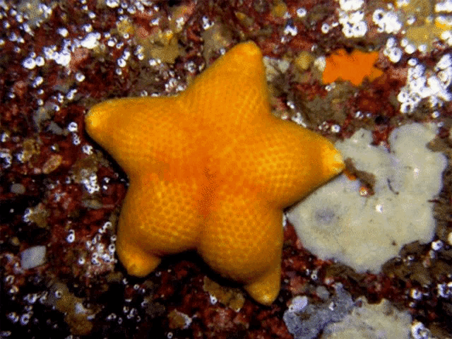
What if you leaned into the simplicity of the star as the primary symbol, supported by a distinctive typographic lockup?
- ********-9
Maybe something like this?

- 5 min sketch in Figma, but you get the idea...********
- I prefer this one, feels more "cultish".palimpsest
- Always avoided designing signs like these because they keep reminding me of Star Wars logos
https://i.ebayimg.co…********
- 5 min sketch in Figma, but you get the idea...
- Ianbolton7
I personally like B2 as it brings in a feeling of ying/yang. Is that something that could be developed more? Be interested to see the final app as I see a few of these around at the moment. I really struggle with self regulation and routines.
Keep up the good work and love how you're sharing it with us too. :-)
- face_melter9

- flol!!Continuity
- and you've got your head... ALL THE WAY UP ITcannonball1978
- slappy1
I don't want to be discouraging however the mark does look like Googles AI overview symbol (ask google a question in a search) which is opposing the idea of self and is widely visible. As I mentioned above, I would work on the type, see what comes out of it and then decide if you need a mark and what that might be having established the type feel.
