Christmas Card Font Hell
- Started
- Last post
- 11 Responses
- freakpelican
Old studio of mine that caters to a very specific niche of elite locals for portrait photography also ends up doing a pretty decent amount of christmas cards every year.
Two years after i last worked with them they are needing me to come back for this task in a pinch, i am getting fowarded cel phone images of other peoples cards with "client wants this font"
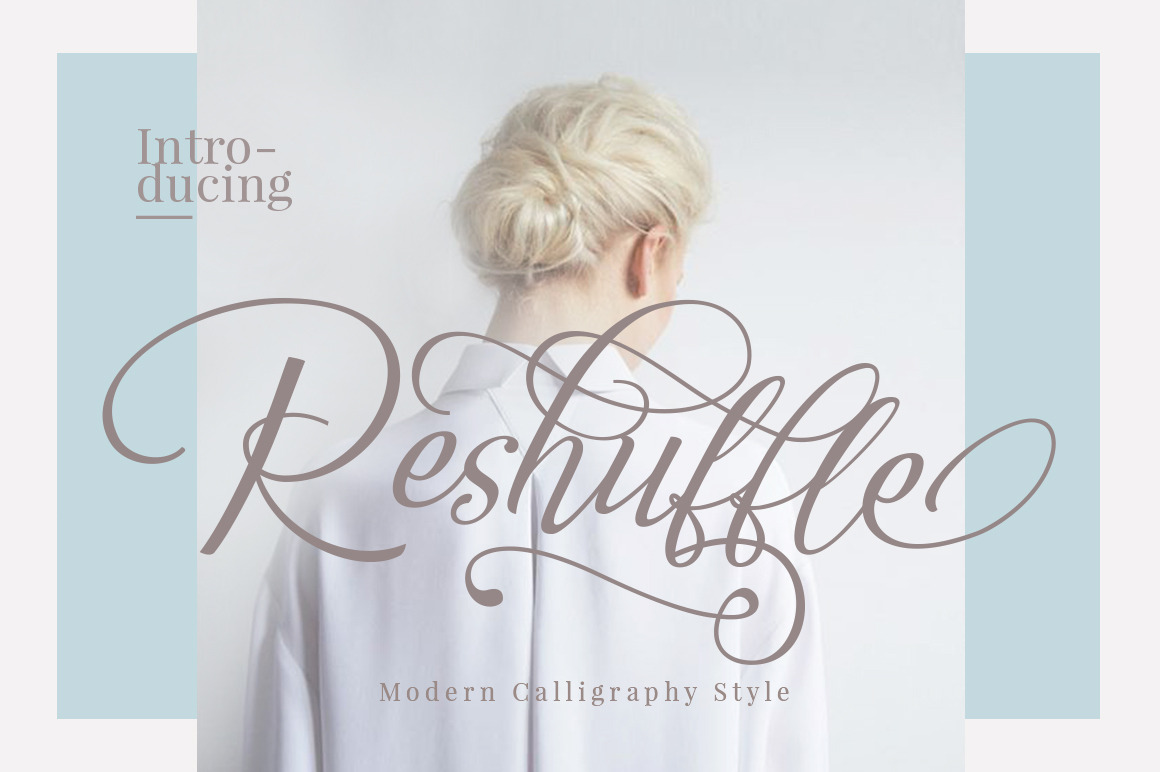
I am having a lot of problems finding this font with the super scripty letters in lower case.
)
- freakpelican0
They want the very same phrase from someone else's card they received last year and in the exact same font... I have sent two other similar options and they are not budging, they need these damn H's to have the swoopity swoop
- dopepope0
That might be custom tho.
- With this clientele i doubt that they would care enough to have a custom font for their christmas card...freakpelican
- it was a local competitor in the area that designed this example provided so i cant exactly call them and askfreakpelican
- but its just another photo studio so custom font work seems unlikely.freakpelican
- feel0
just trace the same thing then
- Really? Tracing it from a shitty cel phone image seems like a lot of work compared to just locating the font.freakpelican
- ask them to scan it, and you can duplicate repeated letters, it is one solution if you can't find the fontfeel
- It's all you can do really, if they aint gonna budge, like you mentioned. finding this exact font is a long shotdopepope
- You could have traced the H a bunch of times in the time it took you to start/respond to this thread. :)MondoMorphic
- I know i could have traced this but i need to lay out this card in a different paper size and they want to see layout options.freakpelican
- Just thought it'd be nice to have the actual font..freakpelican
- That's cool...it definitely makes it a much more manual process.MondoMorphic
- lvl_130
maybe it's a ligature in the H. open the character mapping and see if they have an alternate in the font you are using?
- sorry, I thought you may have found the font-just needed the swoopity swoop.lvl_13
- I thought the same ... just a discretionary ligature or special charactermonospaced
- dopepope0
look at the L's. In 'Glory', it's got a huge flourish. in 'herald' it doesn't. That makes me think at least some of this font is customized. Maybe ornaments/flourishes were added to certain letters, in certain areas to create that flow and balance.
- same with the G'sdopepope
- unless that's the difference between the uppercase and lowercase of that font.dopepope
- ^ might be a ligature in additional characters like I mentioned.lvl_13
- yeah alternatesmonospaced
- sted0
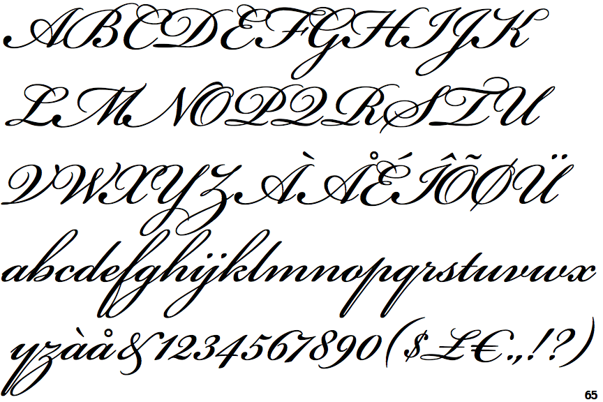
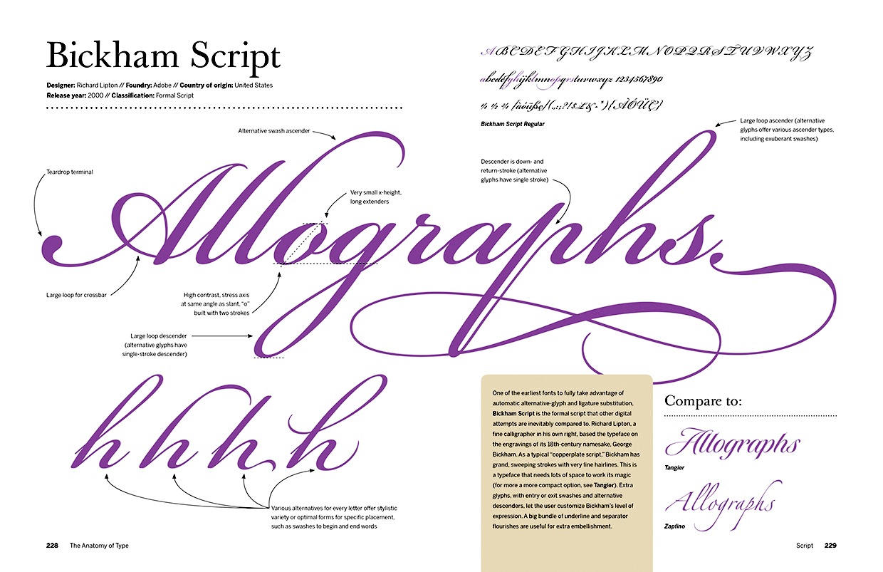
Bickham Script (Pro)
- sted0
- noneck1
Bickham Script is nicer, but doesn't have that over-the-top calligraphy flavour that the client's looking for. Here are a couple that get you kinda close.

https://www.designcuts.com/produ…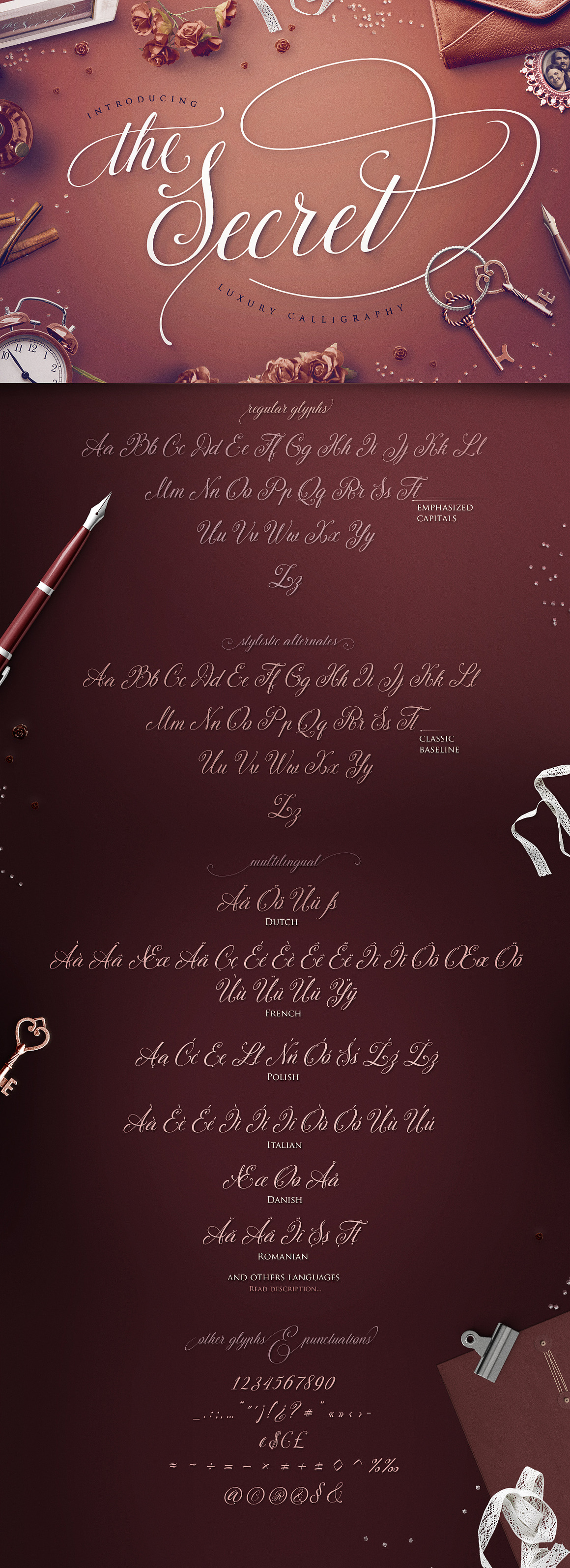
https://creativemarket.com/Bless…
https://www.designcuts.com/produ…
https://www.designcuts.com/produ…- i don't get it the 3.0 has these, like in the example freakpelican posted...sted
- dbloc0
This one has a crazy h