New Hershey Logo
- Started
- Last post
- 28 Responses
- Wolfboy0
The thing is their own provided spiel says:
'signaling the company’s evolution from a predominately U.S. chocolate maker to a global confection and snack company'
which kind of says they are aware that globally they just don't have the brand equity to own the shape of a steaming pile of shit and make it mean something different.
What a curious decision for a company to make.

- monospaced0
^ In the US, the shape of the Kisses (drop of chocolate) goes back over 100 years, and is pretty iconic to the whole nation. That said, the logotype they had was just as strong, and the Kisses certainly don't represent the whole company in my opinion.
Huge at Christmas here too.
- Fax_Benson0
the turd is probably the best bit
- animatedgif0
At least it's honest, shitty logo for shitty tasting chocolate
You know when you throw up in your mouth, that's the exact taste of Hershey chocolate to me.
- sarahfailin0
the little paper label coming off looks like fresh steam rising off of it too-- it doesn't make sense for there to be a paper label on an unwrapped kiss anyway.
The other thing is that they're dropping the 'S -- To me it's always been Hershey'S Kisses, Hershey's chocolate, not Hershey Chocolate or Hershey Kisses.
- the little paper sticking out helps to unwrap it, and it also adds brandingmonospaced
- oh, I see what your'e saying, because it's brown it's already openmonospaced
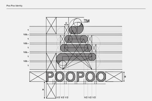
- poo seeyurimon