New iStock Logo by Build
- Started
- Last post
- 23 Responses
- nato0
Well, that TM doesn't resolve too well on screen...
- utopian0
All shit!
- ideaist0
Yes, the trend of no trend.

http://en.wikipedia.org/wiki/No_…
The final section of the book discusses various movements that have sprung up during the 1990s. These include Adbusters magazine and the culture-jamming movement, as well as Reclaim the Streets and the McLibel trial. Less radical protests are also discussed, such as the various movements aimed at putting an end to sweatshop labour.
Klein concludes by contrasting consumerism and citizenship, opting for the latter. "When I started this book," she writes, "I honestly didn't know whether I was covering marginal atomized scenes of resistance or the birth of a potentially broad-based movement. But as time went on, what I clearly saw was a movement forming before my eyes."
- Christian0
I wish I had clients like this. Although, it might take a lot of work to design something so bland. $$$
- hans_glib0
you have to admire the salesmanship that must go into foisting this kind of third rate crap on clients. The post-rationalisation of something so dull and bland must be an art form in itself.
- Beeswax0
or is the client's request to have something, you know, veeery simple, veery clean, a logo but not like a logo almost none, nothing.
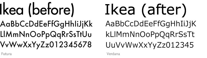
Oh could you try that with Arial too? Our account manager said it's a good one.
- Amicus0
iStock is better than bing or YahoO!, but that's not saying much.
- dbloc0
it's safe.
- MrT0
Surely this is just Getty pissing its territory rather than iStock needing something new. It's now a Getty sub-brand rather than a viable alternative to it.
- animatedgif0
Weird being so vocal that they're connected to Getty.
Getty has pretty shitty connotations, just makes me think of suing the little guy and Microsoft.com/shitty MS print adverts
- ********0
Superb, another wonderfully wasted opportunity for something great.
- ********0
What is it with Build and the weird, tiny elements that scale awfully in any size sensible for the web?


- Doesn't work imo
http://istockphoto.c…
http://made.com********
- Doesn't work imo
- chossy0
I don't like the t it seems a little top heavy :( I wonder what it would look like without the left part of the t... might make too much of a blob of space in the s and t gap though. Anyway fuck sake this really isn't a logo in my opinion :( I tend to like well thought out illus. not too keen on just text.
- Hombre_Lobo0
^yeh chossy.
some logos are great that are simple text (like fedex), but thoughtless process of "choose a font, yeh that logo is done". doesn't really mean a logo to me. (as much as i dislike yahoo logo, at least its taken more thought than this)
Its so clear what iStock do surely they could have had the tiniest molecule of imagination to come up with a logo that actually somehow conveys what they do in a smart and elegant way.
- formed0
Yup, agreed, the logo just feels awkward. Text by itself can work, imo, but this just feels imbalanced and lazy.
- monNom0
It really emphasizes the "tock" for me.