Logo Critique
- Started
- Last post
- 27 Responses
- albums0
No™
These type treatments are superfluous for an architecture firm. All featured here are amateurish. None of them timeless, or inversely, quirky enough for architecture.
The suggestion to take the "lid" off the first option is good. You might try using outlines on that shape as well. Something simple and understated with meaning will be sufficient.
Lose the word Studio, it's cliché. Use only the word URBE, placing it to the right of the mark. Letter spacing should be increased.
- animatedgif0
^ Couldn't agree more ^
- marianaspag0
You guys are brilliant! I feel that I will have to go back and do a lot more work on this logo, but I feel inspired by all the advices... and a bit confused. ;) Thank you so much!
- It's good to see that you're taking the advice well. Most folk who ask for a critique do a runner, never to be seen again. Good on ya and good luckgoldieboy
- Good on ya and good luckgoldieboy
- Thanks, working on it now. :o0marianaspag
- kepp us updatedpressplay
- *keeppressplay
- desmo0
I like 1 and 3. finesse those a bit more.
- GeorgesIV0
I like the 3rd one,
play a little bit the "studio" part, it looks sad alone like this,ASL?
- U doesn't work so well.bainbridge
- I like the 'U' shape. Hadesmo
- _niko0
like the first one, what if it had no roof and made a "U"
- <bainbridge
- Yeah, that could work! I will try to play with types in 3d and see how it goes.
marianaspag
- doesnotexist0
doesn't say architecture, imo. too generic.
or Brazil, which i would think would allow some great cultural references... way too clean for me for what you're telling me this is for.
- do you put an eagle or stars and stripes or the statue of liberty in the logos of your US based clients?pressplay
- i'm not saying that at all, he mentioned it was a SMALL BRAZIL STUDIO. come on, man. think.doesnotexist
- Yeah, clients will be Brazilian and it is based in Brazil. No need to ref Brazil...
marianaspag - then why ask americansdoesnotexist
- Because good designers can design for anywhere, not just their own backyard?MrT
- since when are only americans allowed to the internet?pressplay
- haha, jesus you guys.doesnotexist
- marianaspag0
Thanks George, here is Mariana, 34 from Brasil. I like that option too. Studio really needs a bit of work, you're right. Thanks!
- pressplay0
last one reminds me of this, but maybe that’s because I'm old

- Haha! Oh man, it is very similar, that is not nice. Thanks for the reminder!
marianaspag
- Haha! Oh man, it is very similar, that is not nice. Thanks for the reminder!
- doesnotexist0
WHAT DOES THEIR WORK LOOK LIKE
- doesnotexist0
clean & smart i would've expected you to at least make your own display face for the mark.
- marianaspag0
Hey doesnotexist! Here is a pic of the studio being built. Studio does residencial, restaurants and they are now doing a factory.

- MrT0
I like 1 and 2. As suggested the U could appear in the icon structures, and the backwards S shape in #2 is maybe saying interiors/exhibitions rather than architecture.
As for it needing Brazilian rerefences, sorry doesnotexist I think that'a a clumsy view. If you were offering a specifically Brazilian service to other countries then perhaps, but otherwise, why?
- and I think Gotham works well here too...MrT
- maybe it's wrong, but seeing gotham in there isn't right, imo. don't think it's about choosing a typeface.doesnotexist
- doesnotexist0
like the idea of an isometric object like in #2, but i'd push it more to make it something special after seeing the above.
- doesnotexist0


not saying these are right, but the variation and play on the one mark-object thing says more about architecture than what i'm seeing.
- Doesn't matter how many variants there are within, I'm getting sick of seeing these as examples...detritus
- i know it doesn't matter how many you present, but the above presentation looks like 4 minutes spent.doesnotexist
- i am advocating that he explore that fucking shape some more because it's fucking boring.doesnotexist
- hate them all you want, they're good examples, d.doesnotexist
- doesnotexist0
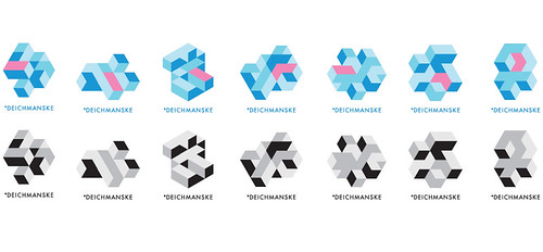
- imagine these treated like your option 2doesnotexist
- lovely!marianaspag
- doesnotexist0
gotham: an american typeface made by americans right here down the street from me.
find a new one. seriously, g'dmit. fucking trend rash.
- + 1, I will fucking remember that next time I want to use that piece of shitAmbushstudio
- Popular doesn't mean bad :/Sandman_1982
- sometimes it does thoughdoesnotexist
- this. Sers.. why Gotham?!?fresnobob
- utopian0
#3
