Logo Critique
- Started
- Last post
- 27 Responses
- marianaspag
Hello guys,
Would love to hear some comments on these logo options. It is a small architecture studio in Brasil. The owner is starting up developing projects for people in his area. I am looking to build a clean, smart, but friendly brand.
I will appreciate your comments.
Thanks,
Mariana.


- GeorgesIV0
I like the 3rd one,
play a little bit the "studio" part, it looks sad alone like this,ASL?
- U doesn't work so well.bainbridge
- I like the 'U' shape. Hadesmo
- _niko0
like the first one, what if it had no roof and made a "U"
- <bainbridge
- Yeah, that could work! I will try to play with types in 3d and see how it goes.
marianaspag
- doesnotexist0
doesn't say architecture, imo. too generic.
or Brazil, which i would think would allow some great cultural references... way too clean for me for what you're telling me this is for.
- do you put an eagle or stars and stripes or the statue of liberty in the logos of your US based clients?pressplay
- i'm not saying that at all, he mentioned it was a SMALL BRAZIL STUDIO. come on, man. think.doesnotexist
- Yeah, clients will be Brazilian and it is based in Brazil. No need to ref Brazil...
marianaspag - then why ask americansdoesnotexist
- Because good designers can design for anywhere, not just their own backyard?MrT
- since when are only americans allowed to the internet?pressplay
- haha, jesus you guys.doesnotexist
- marianaspag0
Thanks George, here is Mariana, 34 from Brasil. I like that option too. Studio really needs a bit of work, you're right. Thanks!
- pressplay0
last one reminds me of this, but maybe that’s because I'm old

- Haha! Oh man, it is very similar, that is not nice. Thanks for the reminder!
marianaspag
- Haha! Oh man, it is very similar, that is not nice. Thanks for the reminder!
- doesnotexist0
WHAT DOES THEIR WORK LOOK LIKE
- doesnotexist0
clean & smart i would've expected you to at least make your own display face for the mark.
- marianaspag0
Hey doesnotexist! Here is a pic of the studio being built. Studio does residencial, restaurants and they are now doing a factory.

- MrT0
I like 1 and 2. As suggested the U could appear in the icon structures, and the backwards S shape in #2 is maybe saying interiors/exhibitions rather than architecture.
As for it needing Brazilian rerefences, sorry doesnotexist I think that'a a clumsy view. If you were offering a specifically Brazilian service to other countries then perhaps, but otherwise, why?
- and I think Gotham works well here too...MrT
- maybe it's wrong, but seeing gotham in there isn't right, imo. don't think it's about choosing a typeface.doesnotexist
- doesnotexist0
like the idea of an isometric object like in #2, but i'd push it more to make it something special after seeing the above.
- doesnotexist0


not saying these are right, but the variation and play on the one mark-object thing says more about architecture than what i'm seeing.
- Doesn't matter how many variants there are within, I'm getting sick of seeing these as examples...detritus
- i know it doesn't matter how many you present, but the above presentation looks like 4 minutes spent.doesnotexist
- i am advocating that he explore that fucking shape some more because it's fucking boring.doesnotexist
- hate them all you want, they're good examples, d.doesnotexist
- doesnotexist0
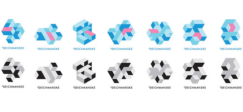
- imagine these treated like your option 2doesnotexist
- lovely!marianaspag
- doesnotexist0
gotham: an american typeface made by americans right here down the street from me.
find a new one. seriously, g'dmit. fucking trend rash.
- + 1, I will fucking remember that next time I want to use that piece of shitAmbushstudio
- Popular doesn't mean bad :/Sandman_1982
- sometimes it does thoughdoesnotexist
- this. Sers.. why Gotham?!?fresnobob
- utopian0
#3
- ********0
#1 but logo either not so heavy or to the left.
#3 I agree with the "studio" issue. maybe some perspective.nowadays you don't know, maybe it's not flat enough...
;)
- Complexfruit0
Suggestion: In the stacked text executions, beefing up "STUDIO" ever so slightly, either by using a bolder weight or adding a stroke to bring them closer in visual weight.
- Nathan_Adams0
You've posted these up with out any context, or much explanation of the concept behind each. Is there a concept you're working to (aside from the obvious roof line in #4, but that implies they only do residential)? "Clean, smart, but friendly" could apply to absolutely anything.
- knobheadfadein11
- How is that being a knobhead? Are we critiquing just aesthetics, or an identity representing a company? Concept is necessary.Nathan_Adams
- suppose - think he just wants some feedback on what hes done though - not a lecture.fadein11
- instrmntl0
i like the second one
