Logo Criteria
- Started
- Last post
- 84 Responses
- oey0
Tomorrow I meet with the client. I still have other directions I want to develop a bit further.
albums, I'm doing one based in yours but with the type mote similar with the one I've drawn previously.
gonna try to put some groove in it.
cheers!
- oey0
Also, a friend of mine mentioned that there's this punk record label in NY that has a swirl as logo and the name also starts with T.
He says it's very similar. I don't remember the name of the label.
- oey0
With the right swirl and following i_monk's tip I can make the TINK! logo with the superimposed swirl inside or outside a circle.
I mean like above if alone or sort like this when the two logos are together.
Something like that...

- oey0
i_monk, these are my first tries of what I think you've meant with the super impose.
actually this happened while I was following instrmntl tips of tighter grooves (I think the tighter grooves are a very good idea to develop in something I'll share next).
- oey0
For mantrakid...


- oey0
UPDATE!
I talked with the client, I used the advice I received here to do so, and we agreed on extra time.
First for him to decide what he really wants and second for me to experiment and develop a better concept.Yesterday and today I had really busy days at my regular job but I used my free time to play a bit with what Ive learned here.
I still have things under development.
It's too many things at the same time, specially drawing swirls.First examples follow both Amicus and Fresnobob's advice.
Changing the K and !.
Removing the swirl or warp or whatever.
A different swirl (just as an example)
Thanks guys!


- stoplying0
Looking at 3 pages of swirls makes me have to go TINKle.
- newuser0
His original was more organic and fun and your simplifications lost that sort of. You can't get that same feeling by simplifying.
- Fatal0
I wouldn't use a swirl for records brand, first thing that came to my mind was Interscope records, they have always used the swirl everywhere
- hans_glib0

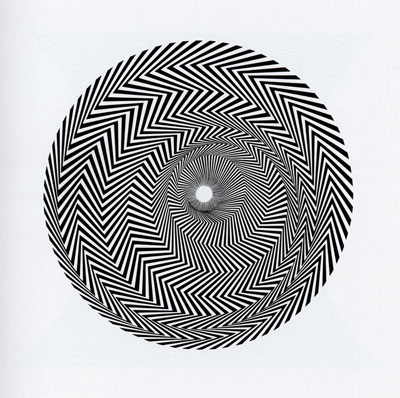
get some riley in yer life
- pig0
I'm liking this Work In Progress thing.
We should nominate a different person each month, like a workshop. But with more cynicism and cats and Lolcubes.
- vsplus0
I thought you might be interested in this guys work as he has dealt with swirl and patterns as well: http://www.etiennebardelli.com/i… aka Akroe.


- oey0
Hey Ho!
I've been busy all day.
Arrived home and couldn't stop making these.
Logo approaches will follow hopefully soon.Swirls (some still need refinement)...


- i_monk0
bump for update
- pig0