DC Comics new logo
- Started
- Last post
- 54 Responses
- detritus0
As someone from an entirely outside the world of American comics, I gotta say I like it. Really clean and clever and, more importantly, not beholden to any specific narrative or age-group.
Much more suitable a media brand, rathe rthan some kid's pulp star mark.
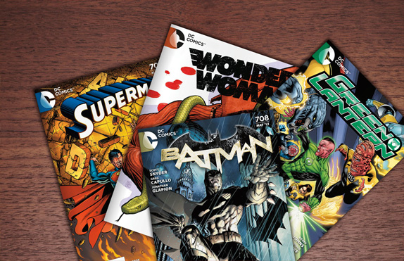
- yup, i think they are staying away from the superheroes branding!k_temp
- Ironmonkey0
still not a fan. So cheesy, non iconic.
- << so true.
The old one had some style, some individuality. this new one is so generic.Hombre_Lobo
- << so true.
- dirtydesign0
looks like an aggressive move into digital world of books and film.
i dig it.
- omg0
I gives it sex-a-peel
- desmo0
Where is the lens flare?
- akrok0
hmm
- zoozoo0
still sucks
- _niko0
actually starting to grow on me a bit.
This makes more sense, secret identities and it looks more like the fold of the comic book cover than a sticker.
- I like the idea behind this. (no pun intended!) Feels more like a TV ident though.Chimp
- ohhk_temp
- yup. knew it had potential. dig this.dirtydesign
- "Feels more like a TV ident though." Wow, well put—didn't think of that immediately but I totally see what you mean.mcmillions
- CanHasQBN0
tasty is right. this logo would be perfect for Discovery Channel... in the sense of "peeling back a layer to discover what's under".
- payton0
Not feeling it. Classic logo that seems forced into a modern design and doesn't communicate comics at all. I feel like they took the whole turning pages/unwrapping a little too literal. > DC, let me take a stab at this!!!
- Hey, if you want me to take a dump in a box and mark it guaranteed, I will. I got spare time. But for now, for your customer's sake, for your daughter's sake, ya might wanna think about buying a quality product from me.payton
- jfletcher0
Everyone complains every time a logo changes... I remember the last time it changed. Except with no internet much to speak of, you didn't hear everyone complaining:

- BozMan0
- < that actually kinda cooldbloc
- what's the one on the bottom left? is that an arrow drawn on it?dbloc
- It's the blood splatter on the smiley face pin from Watchmenmcmillions
- Amicus0
one word: unnnhhhhhrrrrrr?