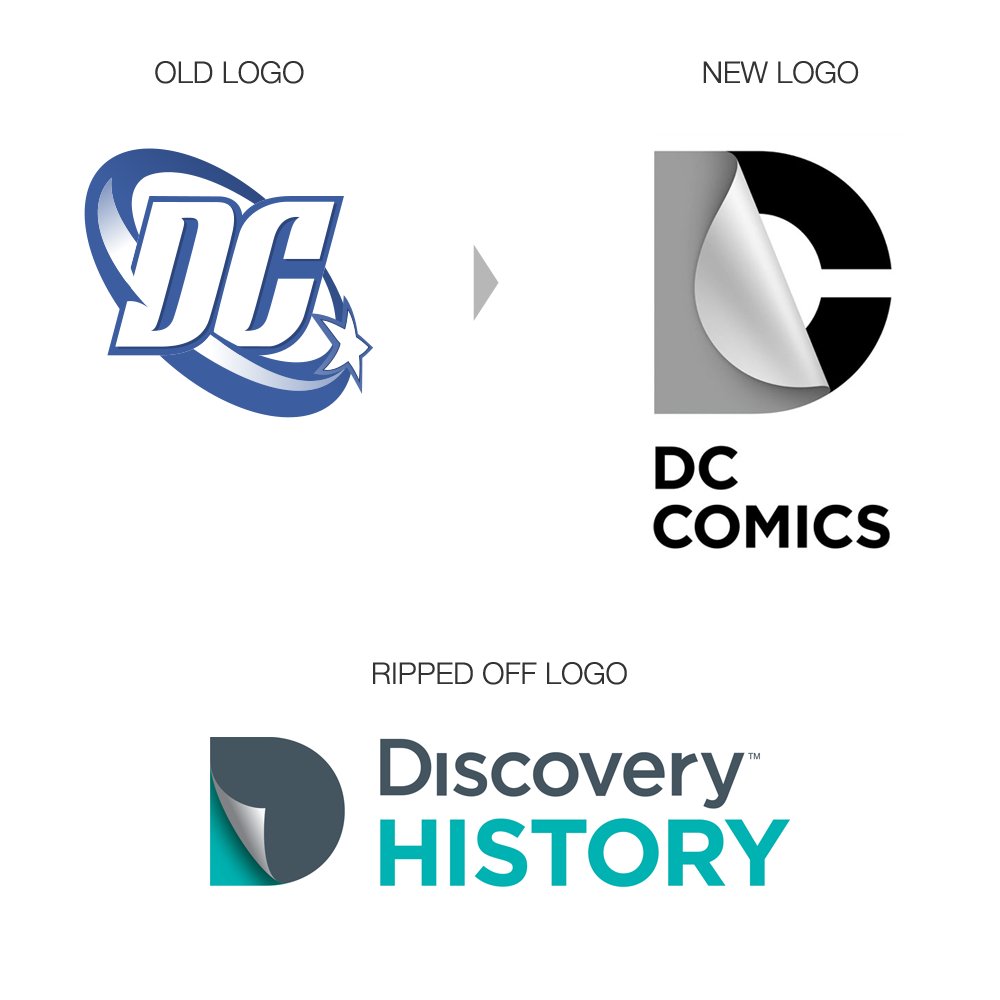
DC Comics new logo
- Started
- Last post
- 54 Responses
- i_monk

Terrible, or just awful?
- johnny_wobble0
i kinda like it.
- bored2death0
nooo... no, no, no. dammit.
- dbloc0
sticker company?
- dbloc0
they just changed their logo to the one on the left last year didn't they?
- hans_glib0
that explains this then

- dbloc0
it kind of makes since for a company with a bunch of hidden identities.
- identity0
concept good.
execution bad.
- bored2death0
Bending a comic book page like that makes it non-mint.
- pitiful_potpie0
Not a fan.
- d_rek0
Terrible for a lot of reasons. Mega-fail.
- M_C_P0
it doesn't scream superhero like the old one.
- desmo0
You are kidding, right? That is terrible!!!
- mcmillions0
I get the concept, but such a clean, sterile logo treatment really doesn't work with a company as intertwined with action-packed superhero stories.
- ********0
FUCKING DREDDFUL

- dirtydesign0
I need to see how this is gonna play out.
I like the idea, not sold on the execution.
- Frosty_spl0
I think the concept is great. But it doesn't work for DC.
- indeed. I prefer its implementation on the Discovery History logo, though.mcmillions
- ********0
[ ] or ][ emphasizing pages
they have nothing with the new logo