State Farm Logo
- Started
- Last post
- 17 Responses
- dbloc
hmmm.
- ********0
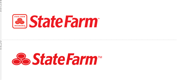
Dumb, as they listed out their three core components. I don't understand why companies feel the need to upgrade, just to upgrade. If it's NOT fucking broke....
- I could hardly put it better.waterhouse
- Cunt.waterhouse
- FUCK YOU TOO********
- fate0
The letterform is improved. And the mark is a lot stronger.
I think it's an improvement.
- fyoucher10
A farm has eggs yeah?
Think they're just trying to simplify it, make it more iconic. I can dig it. Pretty fun brand to work on too, not like some boring insurance companies.
- fate0
panacea, they listed out their "three core areas"? Do you even know what they are?
"Auto. Life. Fire" is what the old logo said. They do way more than just insurance though. It's stupid to have that in a logo when you're working in Mutual Funds or Banking (both divisions of State Farm)
Understand the business before your criticize.
- Then change it completely, I do know what they do, but those areas still hold true. Don't get it********
- Then change it completely, I do know what they do, but those areas still hold true. Don't get it
- i_monk0
Rabbit turds.
- ********0
tsk tsk
- ********0
they have a 3rd testicle.
- waterhouse0
Recognizing that State Farm is now a multi-tentacled behemoth, the previous identity lent a much needed "corner store" feel. Truly, this is only my opinion (and I'm two beers deep) but, I think continuity and an honest nod to your roots go a long way when there's a lot of competition in your industry. I guess I'm not sure that this identity was "broken."
Plus, those new ovals appear as cheap, freshman-year Illustrator ovals to me.- If it's adopted, like everything else, I'll swallow and build up my immunity.waterhouse
- i think you meant "multi-testicled" behemoth********
- ********0
i just don't think they should have released the ovals from the rounded square
- i_monk0
I think the original is pretty bad, but anything is better than the revision.
- SteveZissou0
True egg shapes would've worked better, white and less formally arranged on a red rounded square.
- ********0
the original is conceptually stronger than the revsion.
3 elements joining together ... as one.
so beautiful haha
- CanHasQBN0
both are garbage.
- ********0

- Miguex0
panacea
"I don't understand why companies feel the need to upgrade, just to upgrade. If it's NOT fucking broke....".........................
I don't think its upgrading for the sake of upgrading. A rebranding, even if it's already working is a risk worth taking (some times) to attract attention and looking curent.
Is a way to connect with NEW consumers, (you already have the old ones).

