logo crit please
- Started
- Last post
- 26 Responses
- dbloc0
I agree with using blue instead of red.
- Fax_Benson0
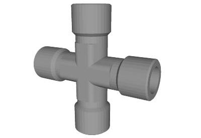
Yep, you need to work on combing the two elements more (they should fit together well) or developing it into something different. At the moment you've just stuck a tap on a cross.
- maquito0
I would try other direction, like for example, the "first aid" concept applied to a tool box / kit, instead of the whole cross thing... that's too easy.
- utopian0
Below are some fairly well done plumbing logos Leftwave. You should simplify the logomark and make it more pronounced. Perhaps making the cross solid blue and adding some water component to it? Or just use typography to articulate your concept...


- sofakingbanned0
I would switch from red. The red cross is pretty set on being medical. you dont want that kinda confusion...
use blue maybe???
- Yes the first thing that came to mind was Red Cross.utopian
- moniker0
Close Photoshop, turn off your computer.
grab a pad and pencil and crawl under your sink at home.
Don't come out until you have a new idea.
- dbloc0
all you did was fill in the cross!? Come on...try to be a little more creative. This could easily be two pieces of clip art put together.
- leftwave0
or maybe this?

- ideaist0

(based on dirtydesign's suggestion above)
Show the tap (in red) but also show the graphic elements behind it that indicate its a tap rather than just the cross...
- dirtydesign0
wonder if something like this could work

- dbloc0
also maybe make the valve be the top of the cross instead of having it extend beyond the cross formation.
- dbloc0
^ That valve doesn't work with the cross. It looks like you just slapped a valve on a cross. You need to make them work together. I think giving the cross a slight pipe look will do it. Don't overdo it though. Just slight divets on the edges.
- CygnusZero40
I think it would look better if the plus was solid. It would make the logo feel stronger, and have the height of the horizontal bar the same as the height of the letters.
- leftwave0
agreed! is this better?
what text layouts work best?
- that plus sign can replace the t in FIRST and be more pipe-like i think.capn_ron
- doesnt look like plumbing to medirtydesign
- I think like others are saying, this is a decent solution, but there is a lot of potential for a more creative solutionrodzilla
- dirtydesign0
looks like u just started. needs exploration.
maybe make that + look more like piping.