Crit My Crap
- Started
- Last post
- 42 Responses
- 74LEO0
Luv splosions!
Try doing film separations of the original then maybe spray paint them and then do an over stencil.
- Something like that would be sweet, but I don't think the composition merits the effort. I'm looking for something with a little less hassle (but no less imaginative value..maybe).PeterPancake
- with? do go on74LEO
- instrmntl0
it actually looks like hipster art. you could totally do a show for fecal face or smt.
- if you painted in some stick figures and random doodles.instrmntl
- I KNOWWW, i could totally see it grace the pages of them-thangs.com et alPeterPancake
- PeterPancake0
Many cheers for the input so far. I’m off out now but I'll try and come back to yous with a more Andy Warhol less Miami Vice redux. And if you're really bored, why don't one of you sukas try an edit?
Any points/input in the meantime are more than welcome. I will respond to them asap.
- SigDesign0
I don't like the background... I like the idea of it, but the execution is just really sloppy, and not a cool sloppy either... it's a lazy sloppy.
Maybe spend some more time on getting your ideal pop art background; possibly separating the bottle from the background and working with both individually to see what happens.
- 74LEO0
I still think you should do color separations, spray paint and stencil. These colors are too bright and I don't enjoy looking at them. I feel like there is no process or craft involved. Why not take this opportunity to do something really creative. Get an old screen from a window and try the same effect.
- utopian0
Thumbs Up!
- PeterPancake0
Thanks, Sig, 74. I can understand what you mean by rushed and sloppy. It totally is. And @ 74LEO (stencil print), just maybe...but I would want to sell the product at a decent price with all that work. How many Dollar? And I'm far from an established artist - I'm not an artist as you may have guessed.
Anyhow, here's a more considered work in progress...l still I feel the colours aren't perfect. I think I like the statement the bud red border makes more than its visual impression. What do the pro-shoppers think, is there still detectable filter use?

- I like this better, but why the giant red border? Think that's distractingSigDesign
- dbloc0
what is this crap?
- _niko0
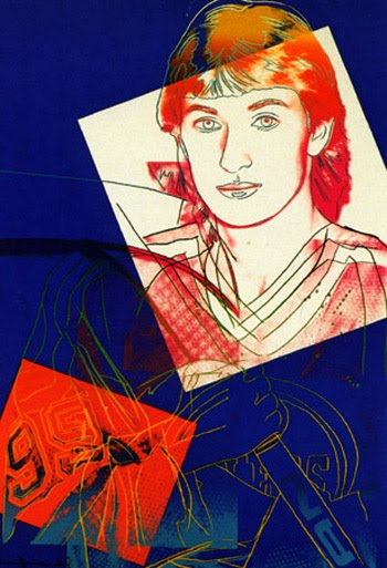
needs more Gretzky.
- PeterPancake0
What about B&W, as below, if I were to bring the labels out? It's a shame the label/bottle shape is not iconic enough as to be identifiable by its silhouette, it would work damn nicely with the indicative colouring of the border.

Taking colour away from it makes it more ______* than Warhol, I feel. Kind of a mash-up/Double-rip.
*insert name of that current artist who depicts words/quotes in bold sans-serif using red, black and white, often using B&W images, anyone?
- Frosty_spl0
Just stop.
- kona0
why did you blow up a perfectly good beer? damn you... DAMN YOU ALL TO HELL
- PeterPancake0
@Frosty Seriously? I thought I was getting somewhere vs my initial treatment on the first page...
- 74LEO0
Is this a joke? The reason why I think this is a joke is because an artist should never say his/her art is crap. If you feel your work is crap then why show it? Take a little pride in your work if anything. Please! How can you put any price on anything if you think it's crap. Come on!!! Get a book on some fundamentals.The reason why I suggest you start doing a craft version first is because you can get lost in photoshop. You'll have a greater appreciation for what you have done when you make it with your own hands. People are always willing to pay more for a hand made original than a photo reproduction.
- sfmkg0
are we really doing this?
- 74LEO0
EOL...
- chalk0
I feel like this entire thread is a big troll....
- i_monk0
Thread is over, your crap has been crit'd.
- cerberus0
"He liked the concept of hurting global brands/established corperations" "provacative"...
I didn't walk away with any of these feelings after viewing that piece. It seems a little pedestrian. More thought needs to go into it.
