Rush album cover
- Started
- Last post
- 28 Responses
- CygnusZero40
Yeah, Rush's long time album cover artist Hugh Syme is great at creating simple images that actually really mean something, that ties in with that albums concept, but the artwork he created is just meant to look cool, Im not a fan of album covers like that.

- mg330
Looks like something a designer for Linkin Park would shit out.
- fooler20
needs more spots...

This might be why I love this breed so much
- Ramanisky20
needs more sauce
- fresnobob0
Oh, so all he did was take their single, add some lame shit, photoshop filters, and make the type harder to read. I'm guessing those symbols are from the zodiac or something, and in that case by replacing them he also lost the meaning of the whole piece too.
Most of those old Rush covers posted are rather simple forms with meaningful ideas behind them. This cover is a complex form with nothing but a literal interpretation, and its not even really up-to-date style wise.
Basically, I don't always agree with this statement, but "Simplify to amplify" would really help in this case. And a 3 day long brainstorming session with some sleep deprivation and/or psychedelics so the ideas really get out there...
- Douglas0
i'd argue that the band name and title shouldn't be there at all. making it bigger or more legible in any way is just going to add to the madness.
- DRIFTMONKEY0
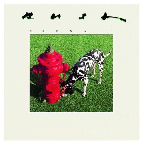
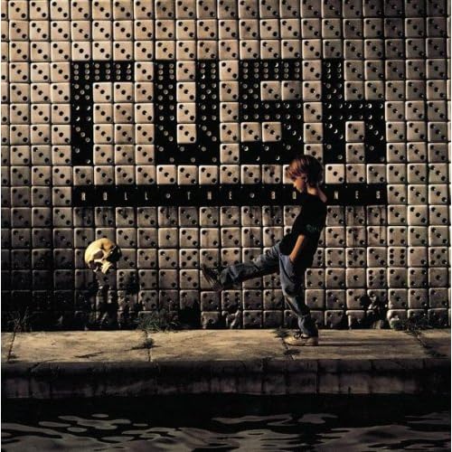
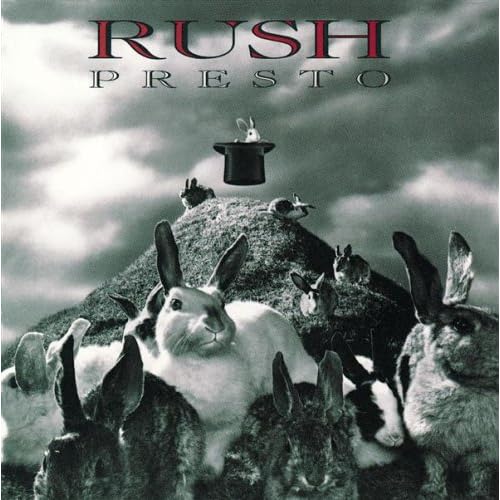
I prefer the playfulness of the old covers:


- fooler20
clock hands should be at 4:20
- Douglas0
it's too literal. i find it insulting, dated, and ugly.
- fooler20
I'm not sure the typical RUSH fan really cares about the over use of layers and effects. Yes, they are over done but their fans seem to be getting pretty old (40 year old men) and they might not be as design savvy as us design snobs on QBN and they just want to listen to Getty Lee scream like a girl.
My biggest problem is it's way to busy, detailed and the copy is way to small. It might work for a 12" vinyl but when it pops up on your iPod you're not going to be able to read it all.
Have designers that do a lot of record covers started to simplify their designs to be easily read on a small digital devices?- Oh you're exactly right, they dont know whats really good or isnt, but that doesnt mean the cover shouldnt be great.CygnusZero4
- And I think that cover designs should be simple, for the reason you stated.CygnusZero4
- Knuckleberry0
I dont know why but it reminds me of this...

the clock/ robot guys mustache and face
- flashbender0
"it needs more thought and less buttonclicking. "
This will be my favorite phrase for the next ten days.
- d_rek0
It would seem to me a band like Rush should have outgrown this type of aesthetic. I mean we're talking one of the most celebrated canadian prog-rock bands of all time...
The cover lacks a certain polish/refinement both in technique and concept to really strike me as something well done or original. You could visit deviantart and almost certainly find something very similar done by any number of wannabe digital artists/illustrators out there. All of the photoshop effects add another layer of amateur execution to the whole thing. The type also does not seem wholly integrated or thought out and mostly gets lost with the rest of the imagery.
All of these things sort of add up to create a composition that is neither exciting or original. What would happen if you put this on the shelf at a store? Would you even be able to pick it out against myriad albums that contain equally poor artwork?
The single artwork is better but is still rather kitschy. Still, it has the refinement the cover you've presented is lacking.
- vitamins0
Reminds me of Dave McKean
- whistleblower0
The design is great IMO, but the title/band name needs to be a lot legible. I would change anything personally.
- scarabin0
how about making the name of the band, which is like the only important information on it, legible?
- Hehe, try to be nice, this guy is gonna read all this. Dont want to ruin his weekend.CygnusZero4
- Clockwork Angels is important too, but I think its too small.CygnusZero4
- CygnusZero40
Like I said Ill repost this there so he can try and get better, since he clearly wants to.
- ckentish0
the wings behind rush title look too much like a mustache
- A kick ass wild west mustache, not good for this though.CygnusZero4
- ckentish0
it looks like the cover of a photoshop tutorial CD compiled by a non-designer who knows layers and effects in Photoshops and little else...
- oh shit! didnt read the reposting bit up top! ouchckentish
- But what do you REALLY think?duckofrubber
- hellojeehae0
readability issue