Rush album cover
- Started
- Last post
- 28 Responses
- bigtrickagain0
yeah... too much drop shadow, too much bevel & emboss, too much texturize. basic layout is nice, but it needs more thought and less buttonclicking.
- stewart0
i see this

- ok_not_ok0
Looks like he went crazy with the PS filters.
- vitamins0
Can we get a link of the message board?
- http://www.therushfo…CygnusZero4
- Of course everyone there loves it, they arent designers though. Figured Id help this guy out.CygnusZero4
- exador10
WAY to busy.
some nice work in there...somewhere......but it's over done...too much stuff going on...not enough time spent on composition, and too much time spent on effects, bevels and textures....
go back, redo from start....
- CygnusZero40
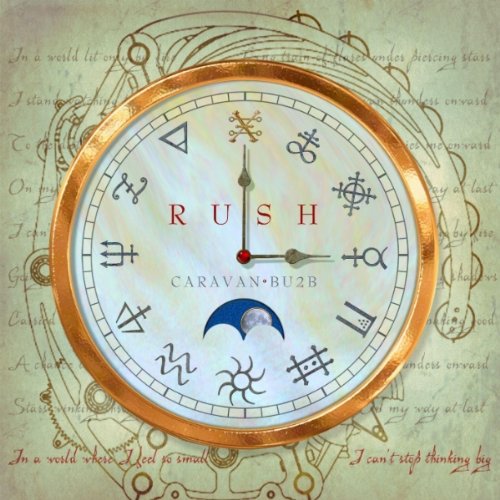
Oh, by the way this is the artwork the band is currently using for their single, so you know what the concept is.
- CygnusZero40
Im going to repost this thread in his thread on the rush board, so any feedback will help.
- vitamins0
I can barely read the title.
- CygnusZero4
I did not make this, it was made someone on a rush message board I go to for their upcoming album, Clockwork Angels.
He posted it there to get some opinions, but many of them are not designers, so I figured I'd repost here to get some feedback on it. I said to him I thought it was too busy, way too much going on, what do you guys think?
